Buttons
Buttons trigger actions within screens and flows in a variety of ways. Button labels communicate what action will occur when interacted with.
A good guiding rule is if the action doesn’t perform an action it should likely be a link. This is flexible based on the requirements of the action and its importance.
Types
We have a default set of buttons and a variety of ways in which they can be used. Documented here are the rules that define those buttons.
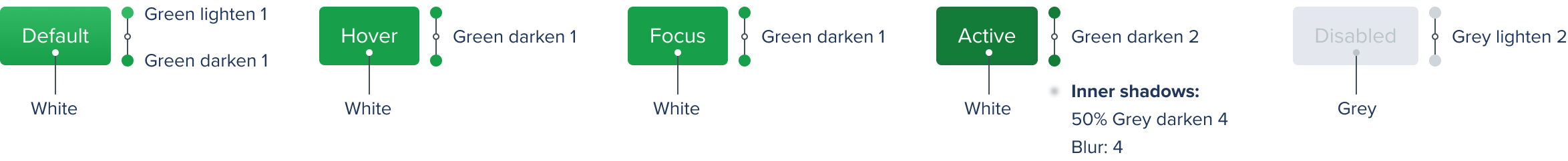
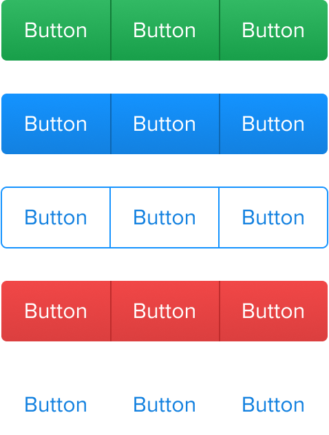
Primary
The Primary button highlights the strongest action within the interface. For example the ‘Enter contest’ button when drafting or submission button on a form.
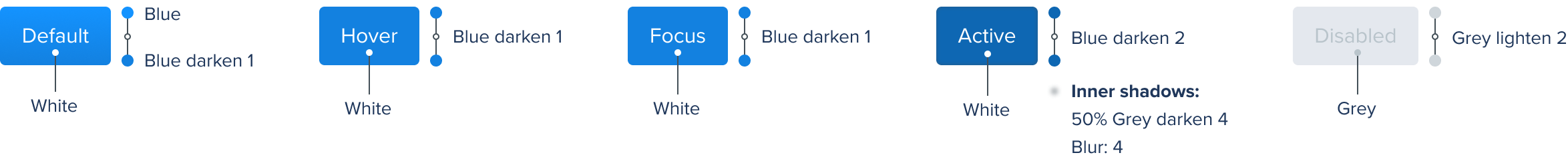
Secondary
Secondary buttons are used for actions where a primary button is not appropriate, when a number of buttons have the same priority but none of them are more important than the others. For example in lineup management where ‘Edit lineup’ and ‘Enter more contests’ have a similar priority level.
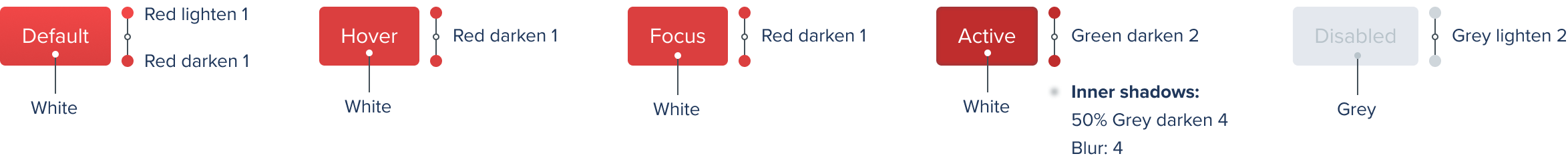
Destructive
The Destructive button is used when an action results in the removal of an item, or can result in a potentially serious negative consequence. For example using a remove from a lineup, and on the more serious side cancelling an entry.
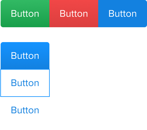
Tertiary
The Tertiary button is a low prominence option. Often used alongside a Primary or as a standalone button with the ability to read more information.

Naked
Naked buttons have the same spacing and alignment rules as other buttons, however they visually look like normal links. This allows them to be used alongside buttons when a low priority action is required, the element is placed alongside buttons, or when a tap target area should be considered.

Specs
Variations

Sizing
We recommend using two button sizes Regular and Small. A good guiding rule is that Regular buttons are used for main actions whereas Small buttons are used for supporting actions.

Spacing
Spacing elements within buttons follows our Spacing guidelines.

Labels and descriptions
Label sizes are set according to the size of the button and should always be sentance case. Descriptions should always use Condensed and follow the type rules set in the Type guidelines.

Corners

Grouping
Grouped buttons are often used when related actions are required. For example switching between All/My entries on the leaderboard or player position in draft.
Do
Use grouped buttons from the same family
Don't
Mix button families