Checkboxes
Checkboxes
These function exactly like you would expect from a standard control. We’re overriding the default platform style to something a little more bespoke.


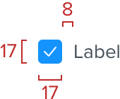
Standard Checkboxes
A white background with a 1px solid border using the border color and rounded corners with a radius of 4px. The label uses copy color.
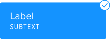
Selected
On selection the border is removed and the square is filled with the link color and our check icon in white at the centre.
Optional subtext
Checkboxes can also include subtext, in the same style as Data chunks.
Selected
Spacing
Checkboxes are 17px square, with 8px spacing between the checkbox and the label. Checkboxes are vertically aligned to the centre of the label.
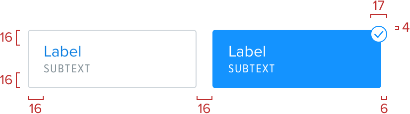
Enhanced Checkboxes
When creating more complex forms it’s sometimes required to add checkbox functionality with more visual prescence. This helps to show what users are selecting and what the available options are. Horizontal sizing of these is flexible based on the container requirements, with a minimum internal spacing of 16px.
Enhanced checkboxes should never be attached to each other.
Selected
These follow many of the same rules as set out in the radio buttons. The primary difference is the floating check mark which should animate in when an item is selected. It’s a circle with a link colored border and a link colored check mark inside.
Spacing
Standard spacing rules apply here, 16px padding all around and 16px spacing between checkbox items. The circled check icon for the selected state is 17px wide and high, and is offset from the top right corner by -4px at the top and -6px at the right. The label font size is 16px and the subtext is 12px.