Empty states
Users are presented with empty states within the app for a few reasons and in a variety of scenarios detailed below. In these situations it’s important we offer a clear, informative and frictionless explanation for the empty state, and an intuitive journey for the user to take to move forward. The overarching narrative should be to engage the user back into the product and encourage further direct or indirect gameplay.
The imagery, metaphors, wording and general tone of voice used here should be inline with our brand values of friendliness, fun and excitement. It’s useful to think about the core message we want to convey in each situation and whether this can be explained using a sports metaphor. Empty states should also be suggestive of the content that will eventually go there and any action the user must take.
Color treatment
Color
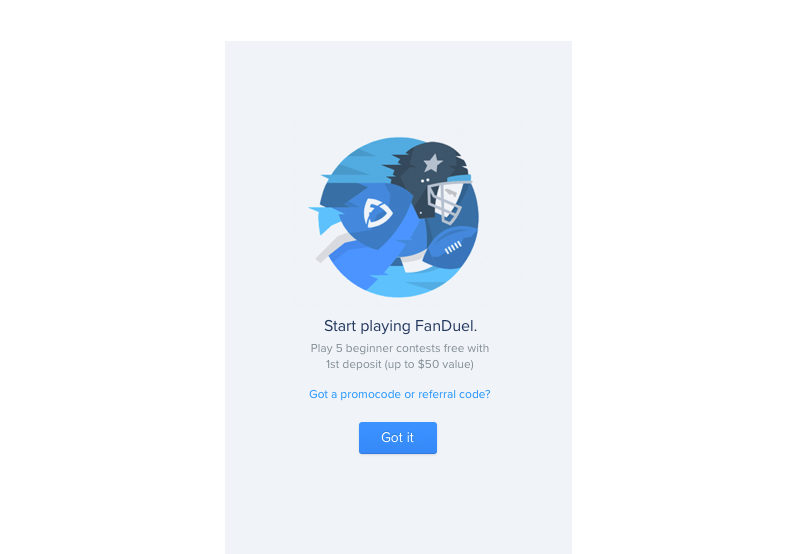
As a guideline color illustrations should be used in the following scenarios:
- Onboarding and new features
- Feedback, informational messages and supporting visuals
- When the message is not negative or focused on missing content, but rather focused on forward progress or onboarding
Greyed
Greyed illustrations should be used in the following scenarios:
- When data will exist in future but has nothing to show at the time
- When there are multiple empty states on the same page
- When the empty state is just one of the page elements and not the focus
- Error state when something external is causing the data not to show
- When the empty state is for a specific set of content eg. Player News

Scenarios and examples
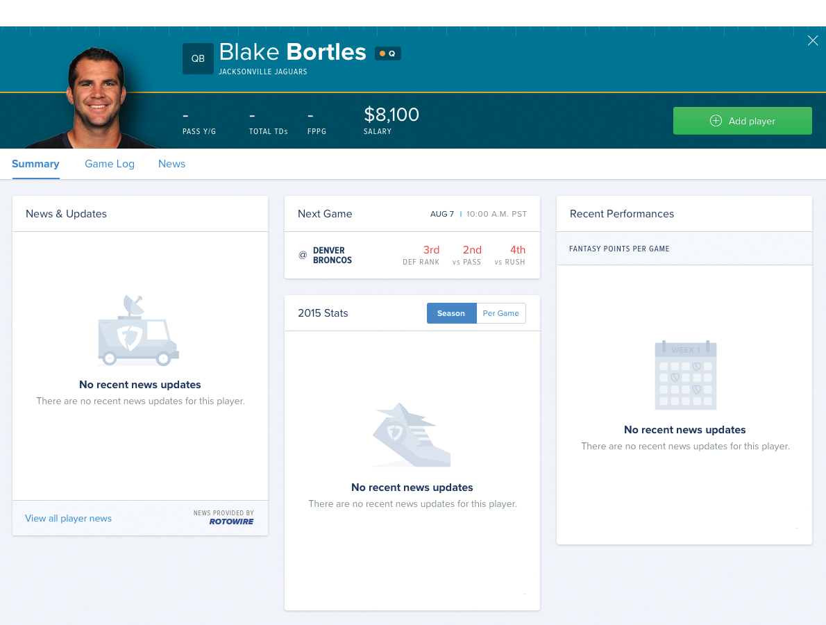
Multiple empty states
Where multiple empty states occur on the same screen, like a player card, all illustrations should use the greyed treatment. An illustration relevant to each empty area should be used and the same illustration should not be used more than once within the same screen, so as to clearly differentiate the content. This example demonstrates the usage (illustrations and copy are incorrect - demo purpose only).
No data exists
Screens where data will exist but currently have no data to show. Use a graphic to suggest the type of data that will go there, and how it can be expected to look. If a user action is required inorder make this data appear suggest this in the supporting text and call to action.

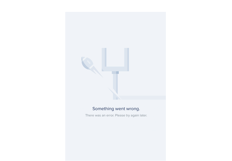
External factors
There is no data to show for an external reason such as a break in season play, lost internet connection. This scenario is the one that will cause the most frustration for users so we must diffuse this. Use a graphic to explain the reason for the empty state and reassure them it’s not their fault. If a set of different content elements on a screen such as an entire player card can’t be displayed there is probably an underlying reason for it, in which case rather than show multiple empty states, we should show a single empty state in place of the different content elements.
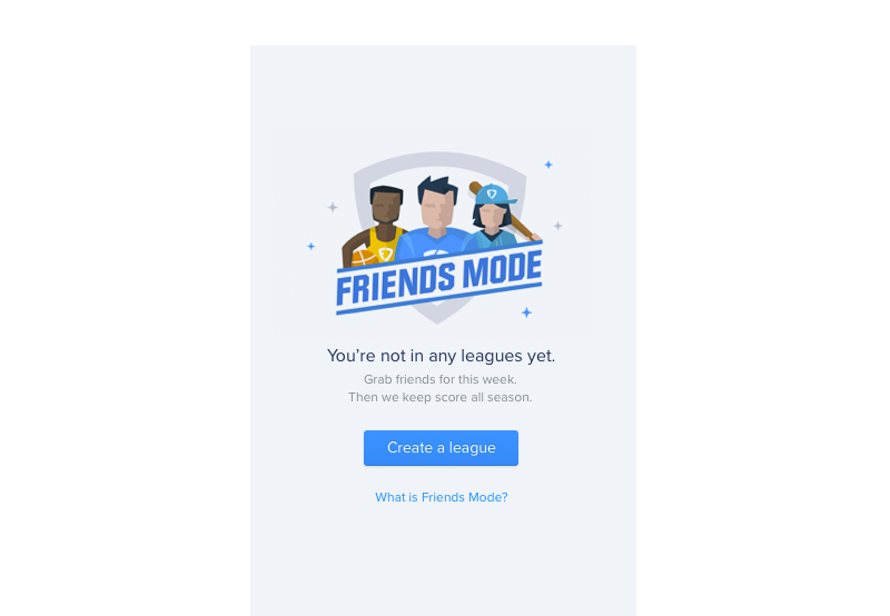
User action required
Direct action is required by the user to get started, such as create a league. This is similar to #1 but varies in that rather than explain why nothing is there, we use the graphic and text to engage the user in the feature on offer and guide them through the creation process, encouraging action.
Key goals
- Offer an explanation for the scenario the user is facing, giving the context.
- Where needed, offer support, guidance and reassurance, and remind them it’s not their fault.
- Diffuse frustration, impatience, doubts or questions that could occur as a result.
- Suggest the type of content that will eventually appear on the page and the layout/structure to be expected.
- If relevant, explain the time element involved, such as a progress indicator or guidance on when they should check back.
- Offer a simple solution and a clear action for the user to take next.
- Offer onboarding and education where required, without being patronising.
- Be concise without being over apologetic or labouring a point.
- Use a friendly, informal tone of voice inline with the brand, and where appropriate, sports metaphors and light humour.
Components
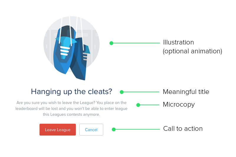
Each empty state should be made up of the following components:
Mandatory components
- Short single line title explaining the situation as concisely as possible.
- Microcopy text offering more detail on the situation and offering an immediate solution.
- Supporting graphic/illustration to add visual impact and meaning to the message.
Optional components
- Subtle animation on illustrations to make them more meaningful and engaging.
- Call to action.
- In the case of onboarding screens for new features, a video or explainer UI element may be appropriate.