Grouped filter
A grouped filter is a way to filter views between contextually-related content or related items. Grouped filters should never replace tab navigation and will always sit below tabs to be used as a secondary way of viewing items.
Options
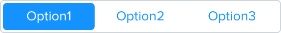
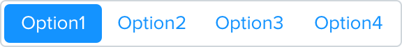
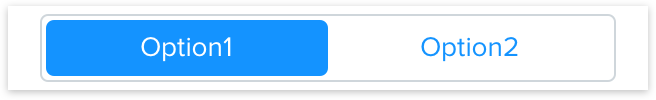
Grouped filters may have 2, 3 or 4 options for toggling:

Styling
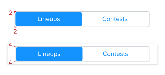
The grouped filter should have a height of 34px that remains evenly full-width no matter the number of options you have.
The grouped filter has a 1px Grey Lighten 2 border and 4px border radius.
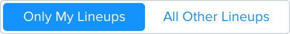
Default Button
Background color is transparent with regular font-weight Blue text and 4px border radius. Android text style uses all caps.
Selected Button
Background color is link Blue with regular font-weight white text and 4px border radius.
Spacing
The spacing between the outline and the fill selections should be 2px
The spacing between the grouped filter and other elements on a page should be 4px top and bottom
Language
No more than one word should be shown within a button. Don’t use icons within the grouped filter buttons.
Do
Use one word within a filter view

Don't
Use more than one word within a filter view
Don't
Use icons within a filter view with text
Scrolling & Swiping
Horizontal
User must tap on the view they would like to see - they may not swipe or scroll left or right to switch views
Vertical
If used in an area where the grouped filter must remain visible rather than being scrolled away - apply the card details shadow to the white background component and have all content scroll underneath