Modals
A modal is a container that pulls the entire attention of the user, requiring an interaction before they can return to their previous location. Because a modal will temporarily interrupt the user from a previous flow, it’s best used for self-contained journeys, or for small messages/promotions which are relevant but not necessarily part of a preceding journey. Modals may be used in a sequence of a few steps, however chaining a large number of modals is not recommended.
In our products we use different types of modals for different circumstances and needs. Modals can be used on both large and small (mobile) screens. However, depending on the size and complexity of the content, some modals on large screens may convert to full screen pages on small screens.

Feature Modal
Feature modals are used for self-contained journeys which require complex information to be displayed, or a series of interactions before proceeding with the main call to action. In our products they have been used to show extra information about a contest, or to summarise player stats and news.
Informational Modal
Information modals are mainly used to send messages to the user, or ask them to perform a simple task or interaction. They are meant to be smaller and shorter, and have been used to inform the user of a state change within the app or journey, to highlight promotional content, or as a quick sign-up for a new feature.
Feature Modals
Feature modals are used to take the user on a contained journey that is separate from the one they were on. Feature modals are frequently turned to full pages in mobile versions of our products, since they may need as much screen real estate as possible.
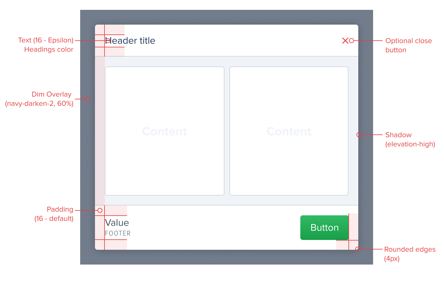
Large screen
The following style guidelines should be followed when using these modals on web:
- Dim overlay:
#000000, 60% opacity - Centered to the screen, both vertically and horizontally,
- Corners:
4px rounded, - Content Spacing:
16px - default, - Shadow:
elevation-high, - Optional close button:
redby default, orwhitewhen background is dark, - May have multiple layers of elevation within them, in which case the first should be a background layer with
screen backgroundcolor. Otherwise, any other color can be used depending on the product and context.
The modal should have the option to either close using a top corner button, or in the dialog itself. If the content of the modal is of particular importance, closing should be placed exclusively on the dialog, since it requires further admission from the user.
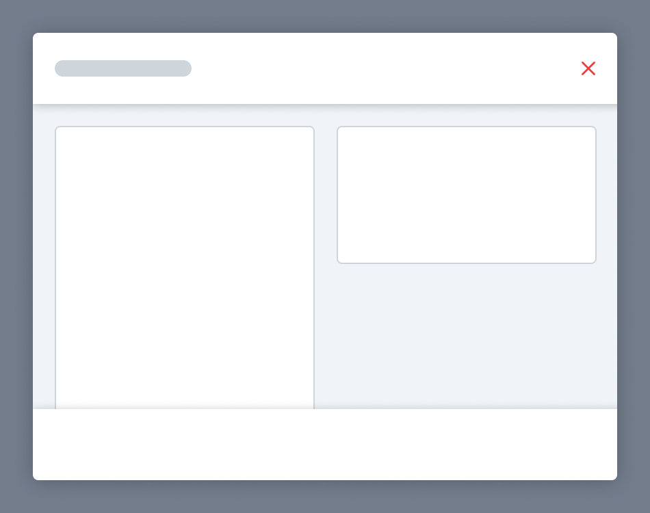
These modals should in general start with a standard header and may also end with a footer. Headers are generally used to communicate what the modal contains, while footers are optional parts of the feature modal, mainly used when there is a clear call-to-action that needs to be highlighted. Modals are also flexible in terms of the components they may include, and thus do not need to follow the example above.
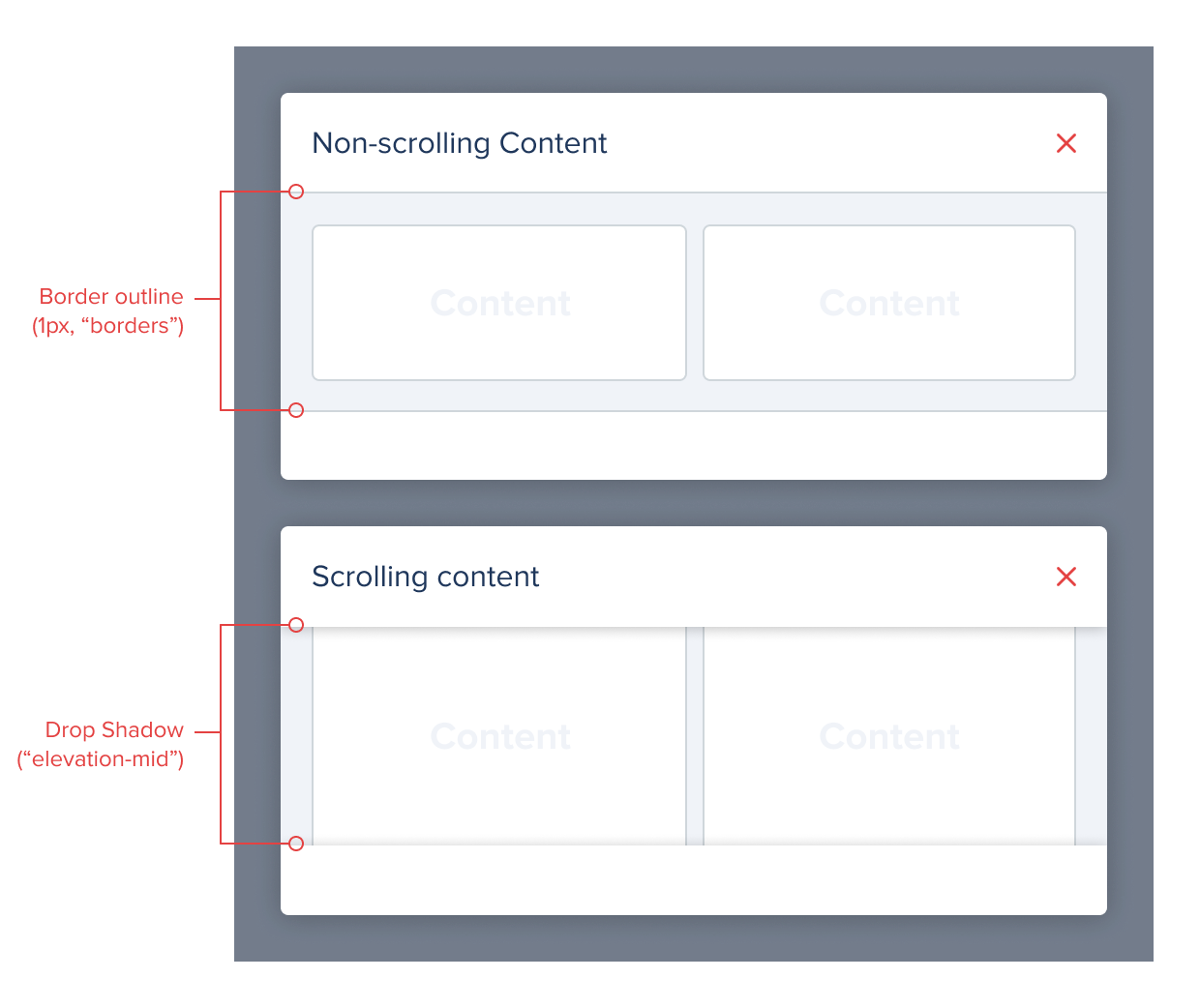
If the content below the header or footer is expected to scroll, these components should be treated as fixed and therefore drop a elevation-mid shadow. Otherwise they should have a 1px border separator on the bottom edge.
Small screen
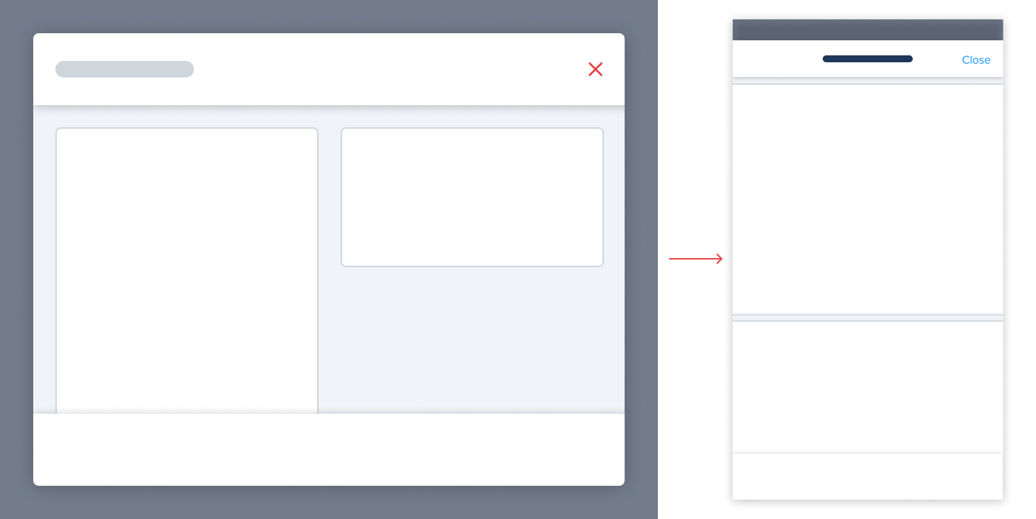
On smaller screens, feature modals fill the entire screen, in order to better make use of the available screen space. In this transition, there’s a few style differences that should be highlighted:
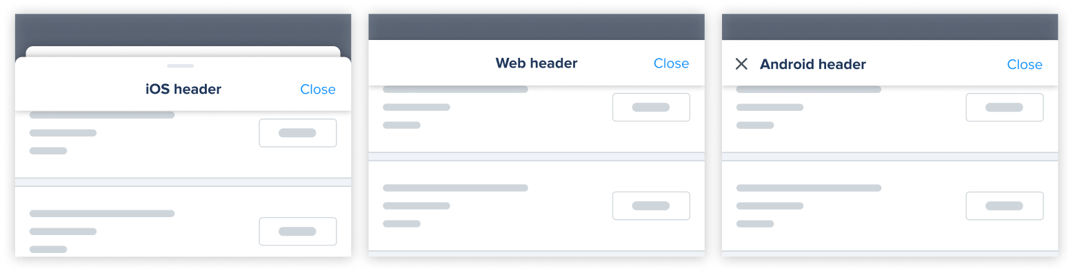
- On iOS (first example) these full-screen modals adopt the presentation of a sheet with
8pxrounded edges and a drag handle, following platform standards. Check the bottom sheet pagefor further styling details. This full-screen modal pushes the screen underneath it to the back and resizes it to show a small peek. - On Web and Android, the header follows a more standard style (the header title is left-aligned on Android as per platform standard).
- The header is pinned to the top of the component, letting content scroll under it if necessary. This is represented by the appearance of an
elevation-midshadow.
In some of our products, the iOS full-screen sheet presentation may not yet be present in all modals, as they were developed prior to the publication of iOS sheet guidelines.
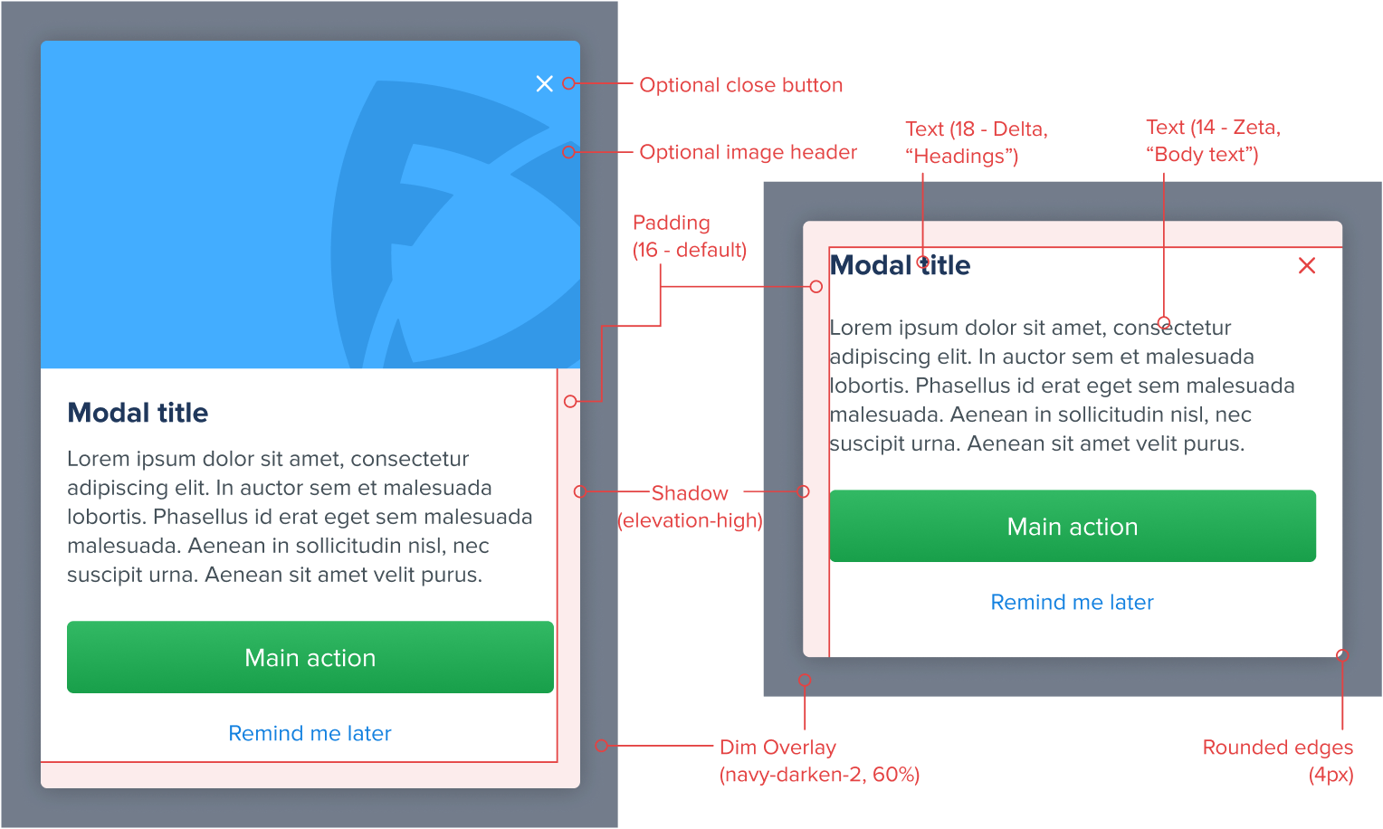
Informational modals
Informational modals are used to send communications to the user that are either not directly part of the user journey (i.e. to surface a related promotion to the user), or to highlight important information from a journey that the user needs to be aware of (i.e. confirmation messages or system status changes).
When using these modals, the following specific properties should be followed:
- Dim overlay:
#000000, 60% opacity - Centered to the screen, both vertically and horizontally,
- Corners:
4px rounded, - Content Spacing:
16px - default, - Shadow:
elevation-high, - Optional close button:
redby default, orwhitewhen background is dark, - Title:
deltasize andheadingscolor, - Body text:
zetasize andbody textcolor,
The modal should have the option to either close using a top corner button, or in the dialog itself. If the content of the modal is of particular importance, closing should be placed exclusively on the dialog, since it requires further admission from the user.
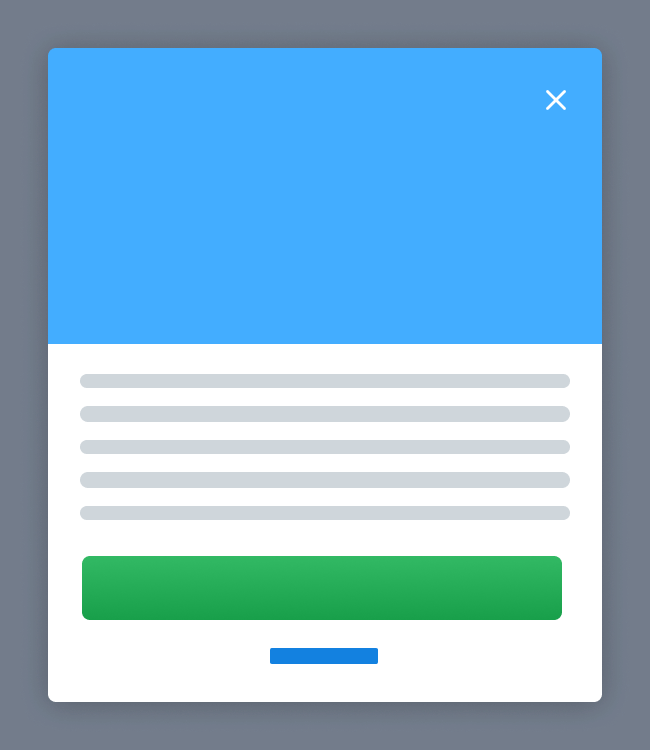
Image headers are optional and usually recommended for promotional communications. If an image is present, it may have varying height, but should ideally be placed flush with the top and side edges of the entire modal. All buttons seen in the example are also entirely optional, as the message may not require any other action apart from closing.