Pagination
Pagination is used as a device to allow users to navigate long lists of related data by breaking it up into smaller chunks. Uses for pagination include contest history, contests listings in the lobby or a list of entrants within a contest. It should be considered a device for casual browsing of entries and for supplementary components rather than actively searching for a specific entry.
Lazy load pagination
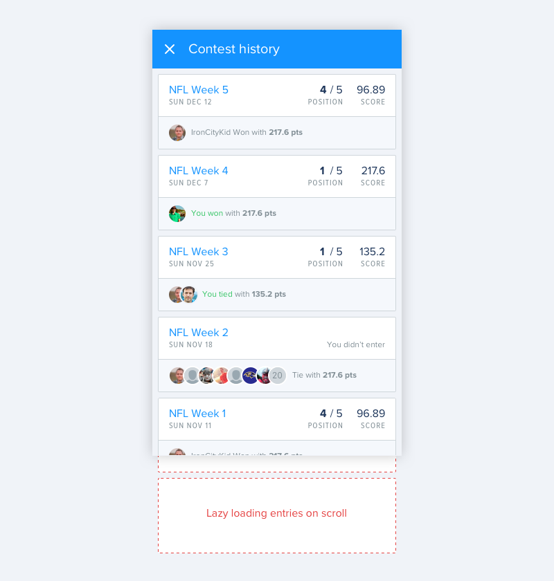
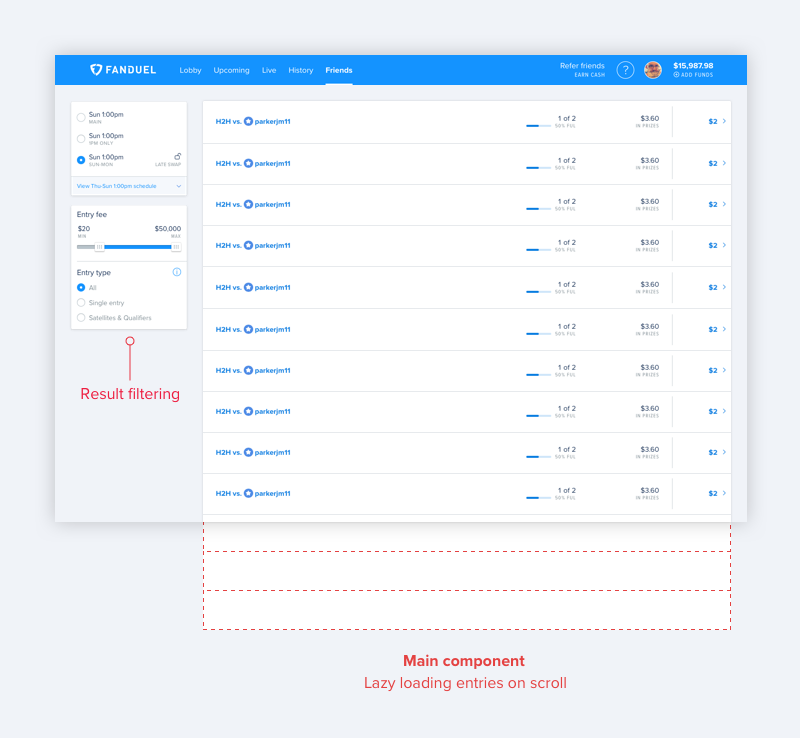
On both native and web, where the page content forms the primary scrolling component, lazy loading is the default pagination behaviour used to load long lists of related content. This will often be sufficient, but it’s important to recognise the point at which a more robust navigation system like filtering, sorting or searching is needed to navigate the content. Some of the factors worth considering here include content length, user behaviour and how critical the component is to the experience of the product.
Native and mobile web
Lazy loading is the default behaviour.
Large screen web
Content that forms part of the page body uses lazy loading.
Additional devices
In addition to the default lazy load behaviour we use supplementary pagination methods where required.
Refresh
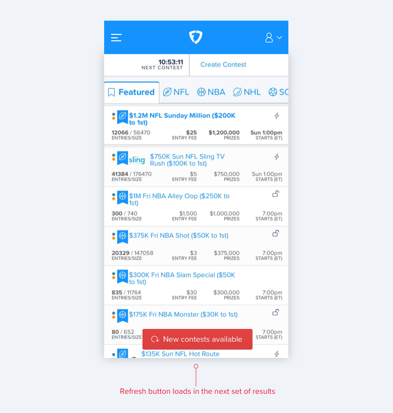
On screens which display time sensitive data such as the lobby we use a refresh button. In the case that additional content becomes available after a short passing of time, and the user remains on the screen, we display a floating action button at the foot of the page which allows the additional content to be loaded in sequentially without reloading the whole page.
Numbered pagination
Numbered pagination is used in medium and large screen contexts to navigate content that exists alongside other important components on the page. Numbered pagination has the following properties:
- Left aligned ‘Prev’ link
- Right aligned ‘Next’ link
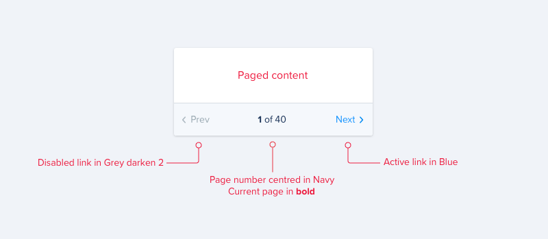
- Centred ‘X of Y’ text in
Navy, with current page inBold - Active links are set in
Blue - Disabled links are set in
Grey Darken 2
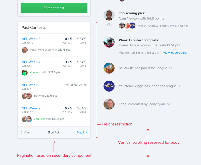
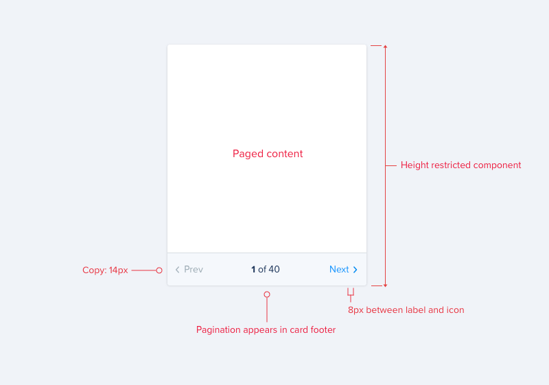
Numbered pagination should only be used to control content that appears within a fixed height card component. The pagination element should appear in the card footer beneath the content. This allows a visual connection to be maintained between the content and controls. Pagination copy should be set in $zeta.
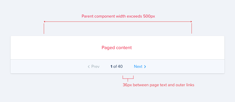
If a card appears in a large context, and it’s width exceeds 500px, the width of the pagination component should be limited by setting the space between the page text and outer links to 36px, to maintain the relationship between the controls.
Usage
A judgement should be made in each case for whether numbered pagination is appropriate. It should be considered if one or more of the following are true:
- The component exists alongside other components
- It is a supplementary component
- The component has a height restriction
- The content of the component has a slow rate of change
Component context
On large screen web where the component has lesser importance within the greater context of the screen, we need to make sure it can be used without hindering the main experience on the page. The primary content in this case will most commonly be scrollable with the page body. When required, pagination should be used on the supplementary component, allowing scrolling to be reserved for the body and avoiding multiple scrolling components.