Radio buttons
Used when there is a list of two or more mutually exclusive options and the user must select one choice. An option will be selected by default and clicking any other non-selected radio option makes it the active selection.
Standard
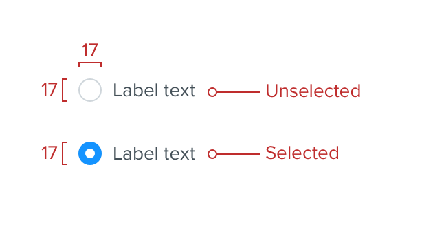
The unselected radio button style has a width and height of 17 with a white background and a solid 1 border using the border color. The label is the standard copy color at 14.
On selection the circle is filled with link color and a 7 white circle in the centre. View the colors rules.
Spacing
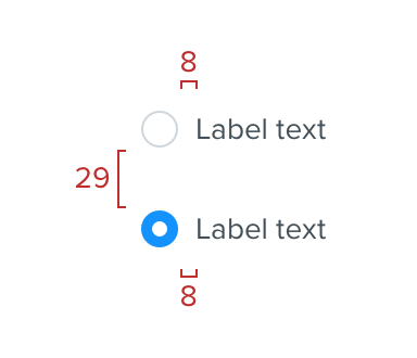
Spacing of 8 between the radio button and the label and 29 between the radio selectors.
Optional subtext
If required, you also have the ability to include subtext. There are two types of subext available to use with radio buttons. The first follows data chunks rules and is used as a label.
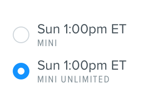
The second can be used if the context is not suitable for a label, such as a description or short sentence. This optional subtext should be Proxima Nova Regular at 12 in Grey darken 3. View typography rules.
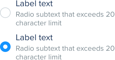
Do
Use body style text for extended content
Don't
Use label style text for extended content
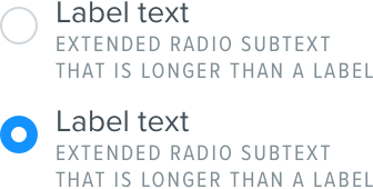
It is important to provide the user with a consistent experience. Therefore we recommend that if you need to use subtext for a radio button, do so for all radio buttons and use the same subtext styling.
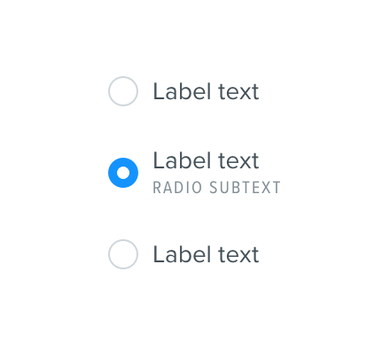
Do
Use subtext for all items if you use it once
Don't
Use subtext inconsistently
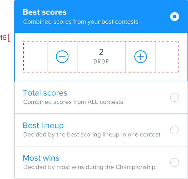
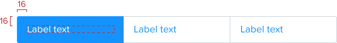
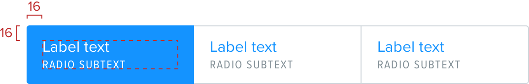
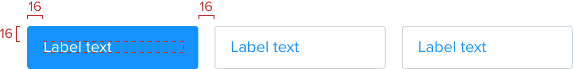
Enhanced radio buttons
When creating more complex forms it’s sometimes required to add radio button functionality with a little more visual punch. This helps clearly show what you’re selecting and what the available options are. Horizontal sizing of these is flexible based on the container requirements.
It’s important to remember that you can still only select one item as per the expected behaviour of a radio button.
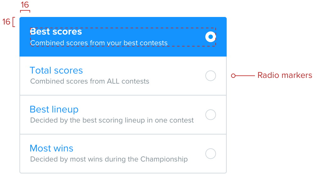
Standard
Our standard 16 sizing rules apply here. The label font size is 16. The border uses the internal border color with rounded corners with a radius appropriate to the platform standard at the edges. On selection the border is removed and is filled with the link color.
Subtext
If required you also have the ability to include subtext. This follows the data chunks rules.
Left aligned text ungrouped
This isn’t used often but can be useful for long lists that scroll off the screen.
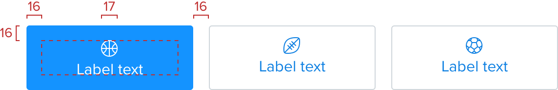
Iconography
Icons float above and are centre aligned. Spacing follows the data chunks conventions.
Vertical layout
In some cases it is particularly important for the component to have more prominence on the screen. This provides more of a focus for the user. Options are stacked vertically and fill the full width of their container. Copy is aligned to the left. A traditional radio marker is used to indicate selection state. This is aligned to the right of each cell and vertically centered.
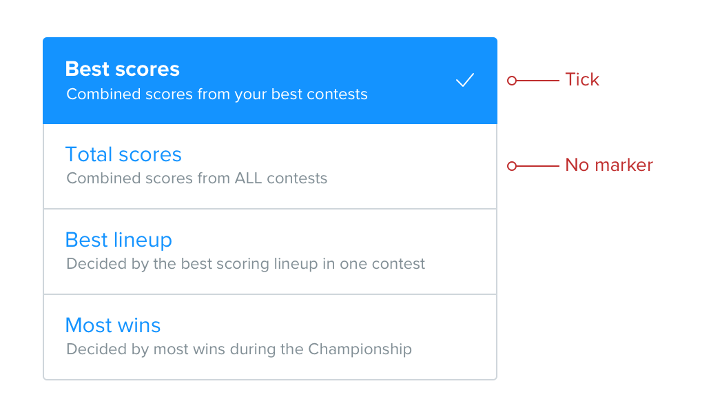

Vertical layout with expandable cells
In cases where choosing an option allows for further granular configuration, the selected cell can, when appropriate, expand to reveal this. The title area of the selected cell remains in the selected state but the expanded area uses a white background and a link colored border to show the connection between the two.