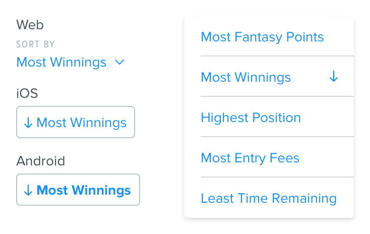
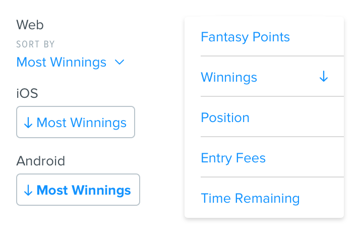
Sort
Used to view information in a specific order.
Options
Sorting can either be a One Way sort (user is only allowed to choose an option which has a set default of Ascending or Descending) or Two Way sort (user can switch between Ascending or Descending).
Component Styling
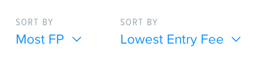
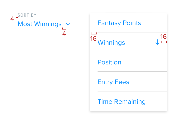
The label text at the top will always say ‘SORT BY’ and is Proxima Nova Condensed, 10 Grey Darken 2
The selection text is Proxima Nova regular, 14 link color with link color arrow to the right of the selection text.
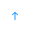
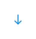
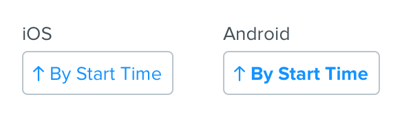
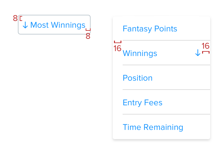
32 tall with link color ascending or descending arrow in front of the text. For Android, the text is not All Caps, but still bold.
Dropdown Styling

Spacing
The sort component has 4 between the label and text selection and 4 between the selection text and the dropdown arrow
The sort dropdown has 16 between the left edge and start of the border line as well as the tick or arrow and right edge
8 all around and 4 between the arrow indicator and the text. Dropdown is the same spacing as Web.
Language
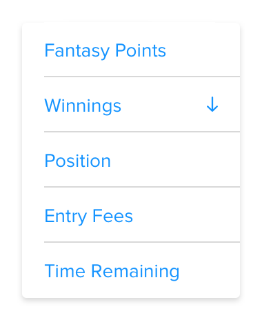
The sort selection will be prefaced by copy indicating whether it’s ascending or descending (Ex: Most vs Least, Highest vs Lowest, Best vs Worst)
Do
Use copy preface in component
Don't
Use copy preface in dropdown