Steppers
Steppers are used to select a number within a range. They allow the user to increase and decrease the selection incrementally rather than having to select from a list. They are typically used for setup and configuration forms, and places where users are incrementing a number.
Spacing
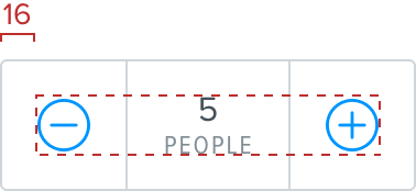
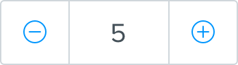
The centre cell uses 16 padding above and below the text. The width of the centre cell is variable based on the content it contains and context it appears in. Stepper controls shouldn’t move as the value increments. The controllers use 16 padding on either side of the icon and the height is dictated by the center cell. The data chunk value is $epsilon and the label is $eta. In cases where the stepper appears in isolation, outwith the context of other form elements, the data chunk value can be increased to $gamma and the label to $zeta. If it’s clear from the context what property the stepper controls, then the data chunk can appear without a label. The controllers can use either a 17, 24 or 30 icon depending on the situation.
Standard
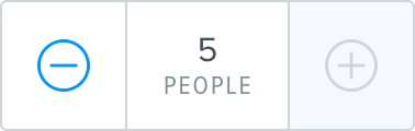
The component uses a minus controller on the left, a plus controller on the right and a centre cell which contains a centred data chunk value. The value part of the data chunk must always be a numerical value. Tapping the left or right controller increments or decrements the value as appropriate. The component uses internal border colored borders, with link colored icons. The label should always specify the units of the value. For example ‘5 people’, not ‘5 number’.
Standard stepper
Standard stepper - no label
Large stepper

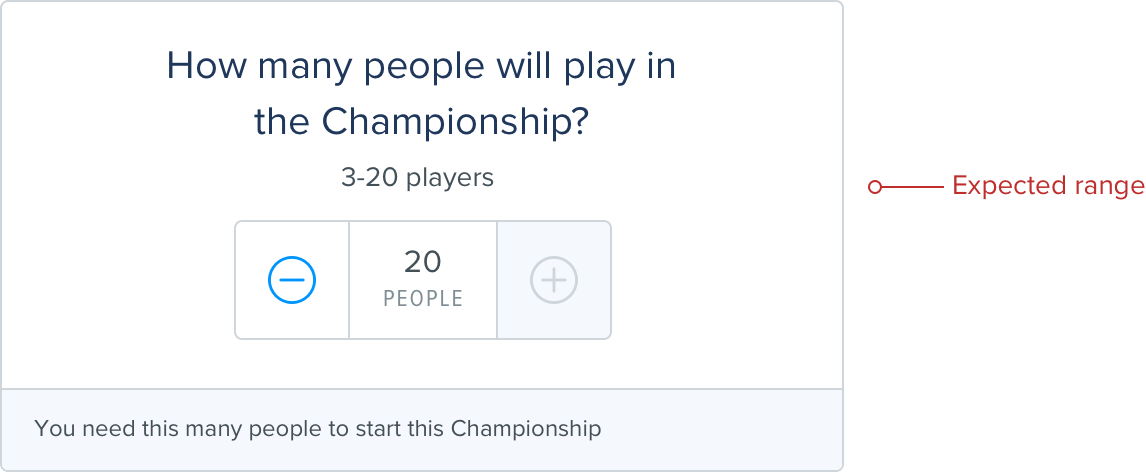
Value range
In situations where a maximum and/or minimum value cap are required, the relevant controller element should change to a disabled button state once the cap is reached - the background becomes Grey lighten 5, and the icon should be displayed in border.
Ideally in this situation the stepper component should be accompanied by helper copy which indicates the range the user can expect.