Tabs
Tabs are a great component to enable switching between grouped content, without having to navigate away from the page.
Colors
Colors for tabs are set based on the background color itself. The general rules are set out below. If there’s no background there’s a border on the bottom. White background? It retains the same colors but adjusts the spacing slightly. If it’s a blue background the color and active keyline change to white. Active states use bold text for extra emphasis.
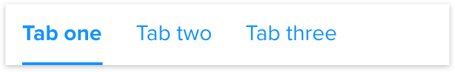
No background
Transparent background with a bottom border using the borders color. Standard link color, with standard link hover color for hover and focus states.
White background
White background, no bottom border and uses card shadow properties. Standard link color, with standard link hover color for hover and focus states.
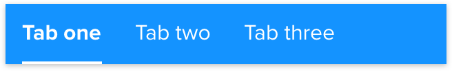
Blue background
Example shows blue but any primary color would follow similar rules, white links and uses card shadow properties.
Spacing
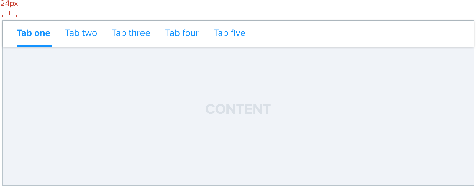
Generally tabs will have a height of 44px and spacing between of 24px with a left alignment. However there are some other options for edge cases where by there maybe more tabs than expected so we’d want to tighten the space or the screen size is incredibly large and we would like to expand the spacing.
Regular (default)

Tight

Loose

Additions
Beyond the standard views included above we also have certain variations that add to the capabilities of the tabs themselves.
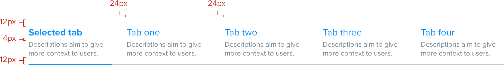
Descriptions
In certain situations it’s advantageous to include a title and description for the link itself. A prime example of this is on the lobby with the contest type selector. Descriptions can wrap multiple lines if required.
Once space becomes an issue the ideal solution would be to drop off the descriptions and move to scrollable tabs as documented below or employ a dropdown selector.
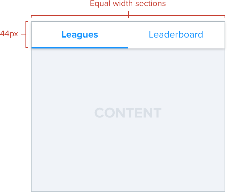
Equal width
This is used traditionally in place of a segmented controller and to navigate between a section like “Friends Mode”. Anymore than three tabs and scroll tabs would be an advisable choice. These “Equal Width” tabs tend to be used exclusively in small context areas.
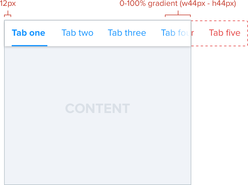
Scrolling tabs
In some situations there will be more tabs than the screen real estate can accommodate. A perfect example would be on player cards as the screen gets smaller. Instead of simply using a dropdown or mystery meat navigation we offer the ability to scroll along the tabs themselves. A good rule is if you have more than three tabs out of sight it’s worth re-evaluating the navigation as a whole to something other than tabs.
Small screen
Large screen
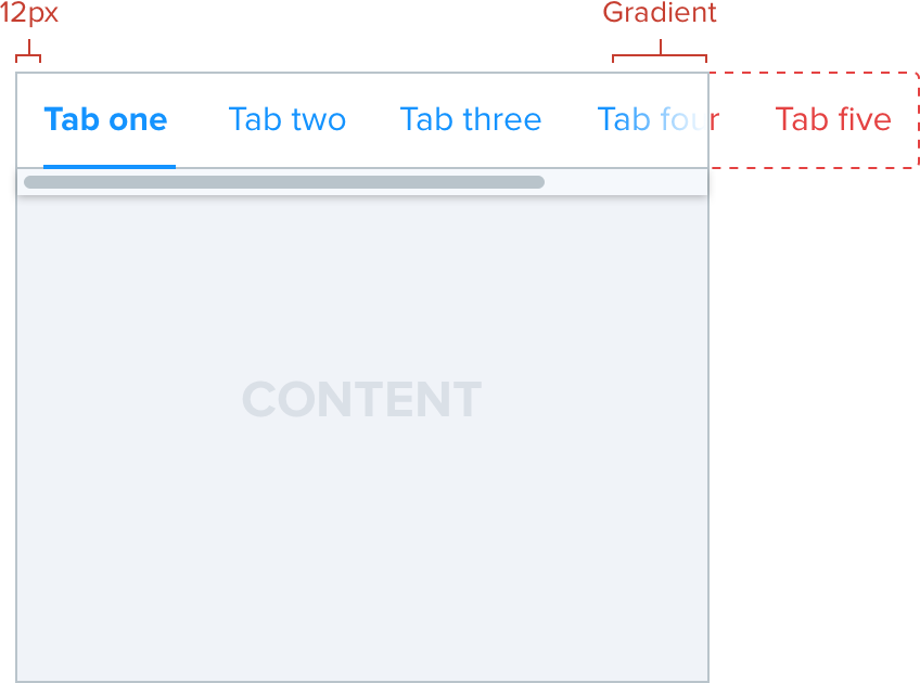
This example provides context of what the tabs would look like before the page is unable to accommodate them in the viewport.
Non-touch based browser
In the relatively unlikely situation of resizing a desktop browser to small screen sizes we would still offer the ability to scroll but with the addition of a custom scroll bar. This is a concession and an edge-case we don’t foresee a lot of users hitting that could benefit from some future improvement.
Gradient: 0-100%, width: 44px, height: 44px.