Writing documentation
Tips, tricks and conventions for writing documentation in the FanDuel design system.
Sizes
When documenting sizes, only use the value. This should take the form 8. The value is wrapped in the code element.
The reason for this is that the three platforms, Android, iOS and Web, use different types of units for sizes.
Do
Always wrap the value in the `code` element
Don't
Use platform-specific units
Inline code blocks
When using values, use inline code in your markdown to show that. Examples are colors and sizes.
To make an inline code block in markdown, use the code from the example below:
The element's background is `FanDuel Navy`.
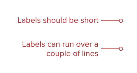
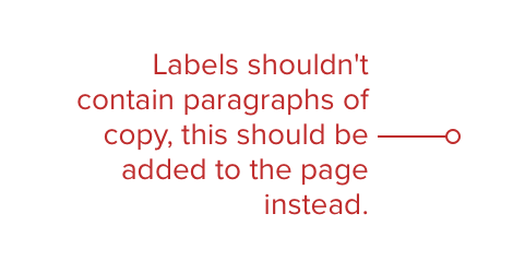
Labels
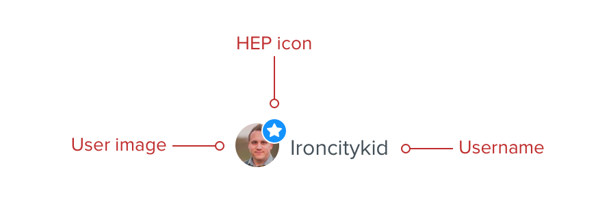
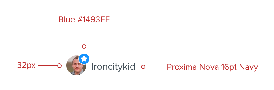
Most contextual data like size and color should be included in the description text on the page itself, but where neccessary labels can be used to highlight specific elements or properties. Labels and markers should be set in Red darken 2, with Proxima Nova 14pt used for the label copy.
Do
Call out specific elements
Don't
Add contextual information within the labels
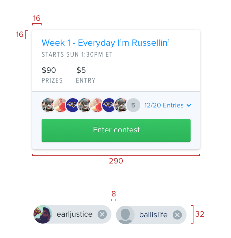
Spacing indicators
These are used to indicate any spacing information about a component. They can be used vertically or horizontaly and should appear 8px away from the component so as not to obscure it. The value appears without units due to our various platform differences.
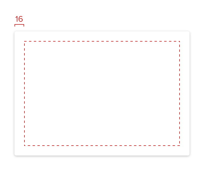
Inner space
A dashed bounding box can also be used along with a spacing indicator to show consistent spacing within an element.
Images
To display images at the correct dimensions, save as an @2x .png with a transparent background, then insert into the page using the retina image twig.
{{< retinaimage inner-spacing >}}
Status information
The status, and status_details parameters should be used to denote documentation or components which aren’t finalised, or have been deprecated.
In the index.md file of a document the following parameters can be added before the last +++ at the top of the file.
status = "wip"
status_details = "Covers base guidelines and approaches to pagination"
| Status | Output |
|---|---|
| wip | wip |
| deprecated | deprecated |
Dos and don’ts
To show examples of what to, or what not to do with a component the following twig can be used:
{{< donot
    do_enabled="true"
    do_subheading="Use text fields like this"
    do_image="label.png"
    donot_enabled="true"
    donot_subheading="Use text fields like this"
    donot_image="label.png"
    donot_copy="You can also put some text inside the example"
>}}
Do
Keep labels short
 You can also put some text inside the example
Don't
Add lots of copy to labels
 You can also put some text inside the example
If only a do or don’t needs to be displayed settings do_enabled or donot_enabled to false will hide the releant block:
{{< donot
    do_enabled="true"
    do_subheading="Use text fields like this"
    do_image="label.png"
    do_copy="You can also put some text inside the example"
    donot_enabled="false"
    donot_subheading="Use text fields like this"
    donot_image="label.png"
    donot_copy="You can also put some text inside the example"
>}}
Do
Keep labels short
You can also put some text inside the exampleDon't
Add lots of copy to labels
You can also put some text inside the exampleQuick tips
Quick tips are useful for calling out small pieces of information. The block floats to the right side of the content item and the content below it in the markdown file wraps around it.
{{< quicktip
    tip_heading="Heading"
    tip_1="List item 1"
    tip_2="List item 2"
    tip_3="List item 3"
>}}
Craft Library
If you add, change, or remove any fundamental items in the design system you will also need to update the Craft Library. Make changes in the Library repo and submit a pull request. Only once both the Library PR and the design system docs PR have both been thumbed should you merge them.
Real world examples
Real world examples are useful to show how a component has been used within the wider context of a full interface. When it’s warranted the following twig will provide functionality to show a thumbnail, and when clicked trigger a large view of the example:
{{< example
    platform="Android"
    title="Signup on Android"
    image="real-world-example_promotions-large.png"
    description="Lorem ipsum dolor sit amet, consectetur adipiscing elit. Etiam et justo nulla. Donec fringilla tincidunt ligula, vitae condimentum mauris accumsan a. Sed vel augue nisi."
>}}
 Android
Signup on Android
Android
Signup on Android
Lorem ipsum dolor sit amet, consectetur adipiscing elit. Etiam et justo nulla. Donec fringilla tincidunt ligula, vitae condimentum mauris accumsan a. Sed vel augue nisi.
Android
Signup on Android
Android
Signup on Android
Lorem ipsum dolor sit amet, consectetur adipiscing elit. Etiam et justo nulla. Donec fringilla tincidunt ligula, vitae condimentum mauris accumsan a. Sed vel augue nisi. Web
Super image
Web
Super image
Lorem ipsum dolor sit amet, consectetur adipiscing elit. Etiam et justo nulla. Donec fringilla tincidunt ligula, vitae condimentum mauris accumsan a. Sed vel augue nisi. Morbi felis sem, imperdiet imperdiet ullamcorper sed, hendrerit volutpat turpis. Vivamus laoreet orci orci, sit amet commodo orci porttitor lobortis. Proin orci odio, porttitor vel dapibus non, convallis sit amet purus. Cras eu tincidunt elit, vitae volutpat lorem. Vestibulum sit amet ex gravida, scelerisque diam at, vulputate lorem. Curabitur sollicitudin ligula in metus laoreet, porttitor dictum velit rhoncus.
Web
Super image
Web
Super image
Lorem ipsum dolor sit amet, consectetur adipiscing elit. Etiam et justo nulla. Donec fringilla tincidunt ligula, vitae condimentum mauris accumsan a. Sed vel augue nisi. Morbi felis sem, imperdiet imperdiet ullamcorper sed, hendrerit volutpat turpis. Vivamus laoreet orci orci, sit amet commodo orci porttitor lobortis. Proin orci odio, porttitor vel dapibus non, convallis sit amet purus. Cras eu tincidunt elit, vitae volutpat lorem. Vestibulum sit amet ex gravida, scelerisque diam at, vulputate lorem. Curabitur sollicitudin ligula in metus laoreet, porttitor dictum velit rhoncus.Tabs
302px, 604px or 906px wide.