Alerts
Alerts are used to inform users when immediate action is required. Alerts disrupt the user experience and should only be used in important situations.
Native platforms
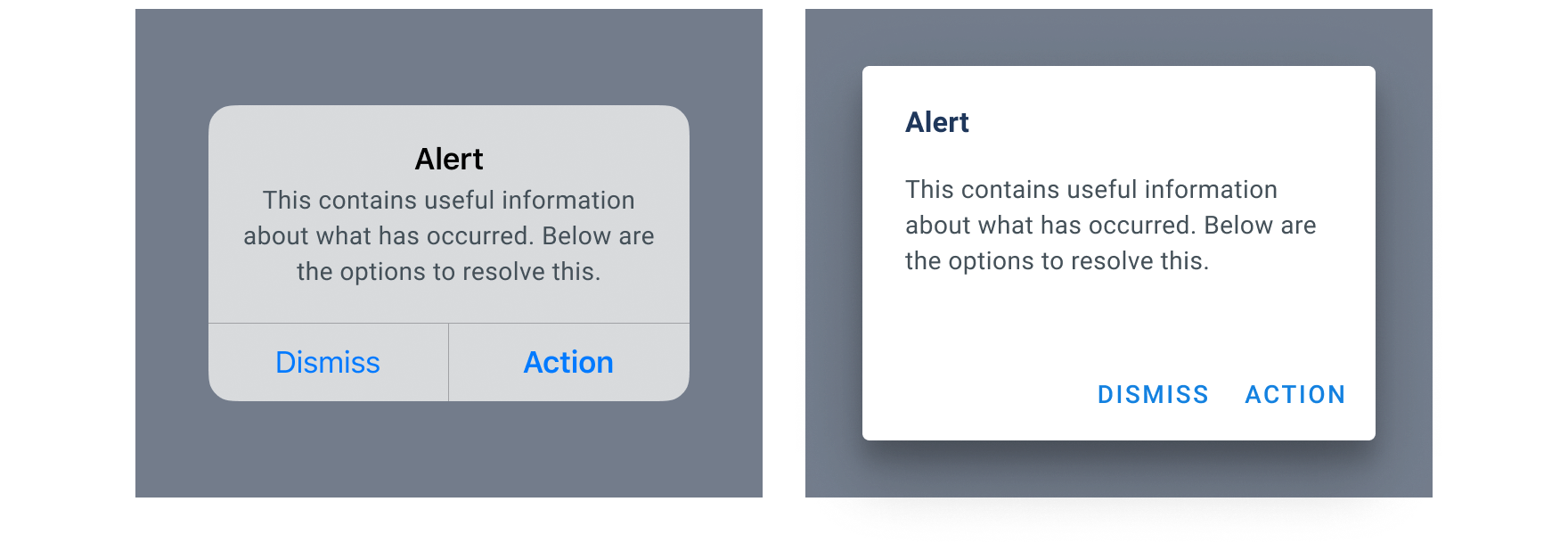
iOS and Android have powerful platform system Alerts. These system Alert styles give a greater sense of importance, and platform familiarity, to that something needs the user’s attention. On Native platforms these system Alerts should always be used in the first instance then falling back to the FanDuel styled Alerts if appropriate.
Web
With no system Alert available on either large screen or small screen Web, the FanDuel Alert should be used in all instances.

Alert style
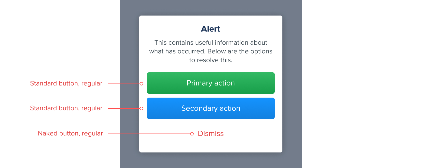
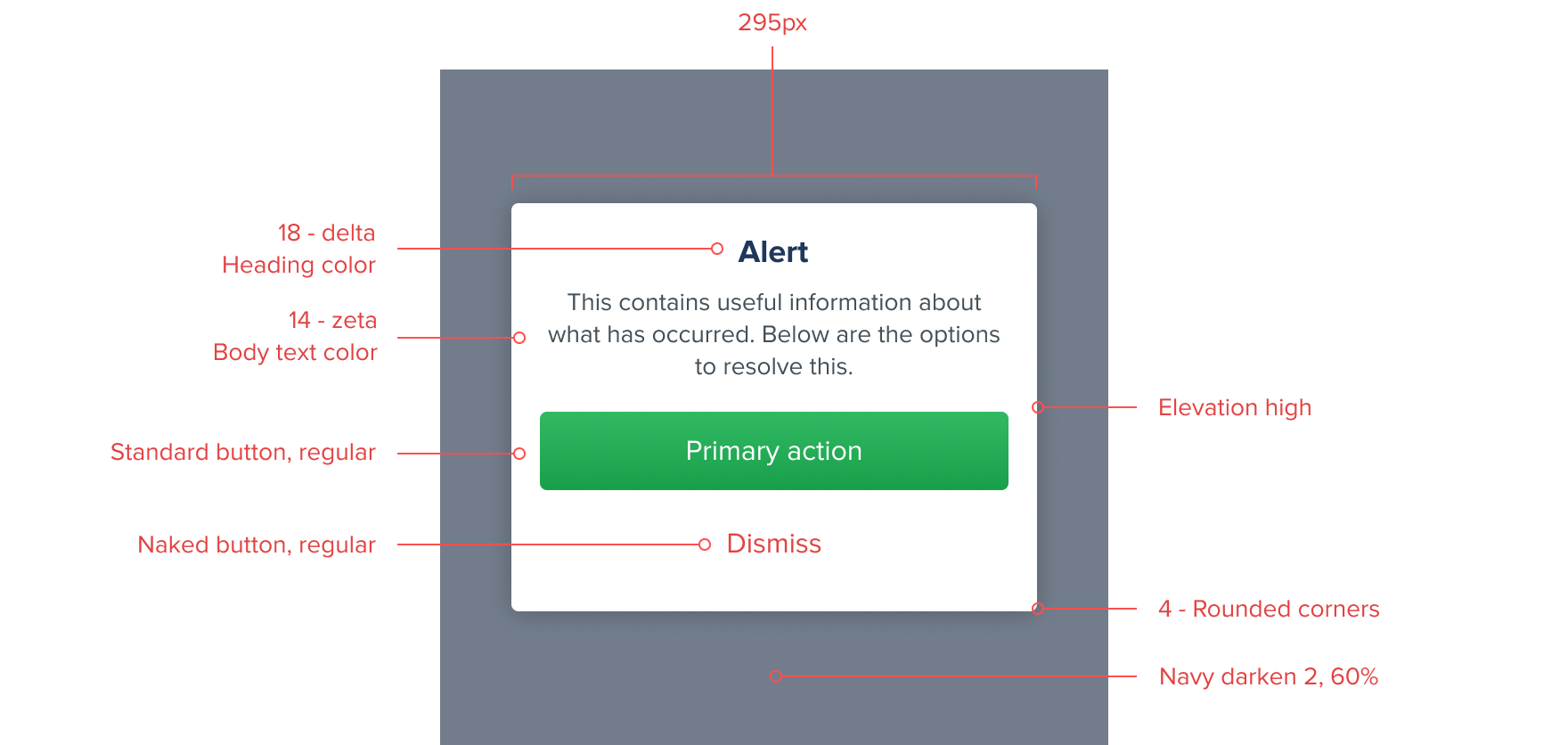
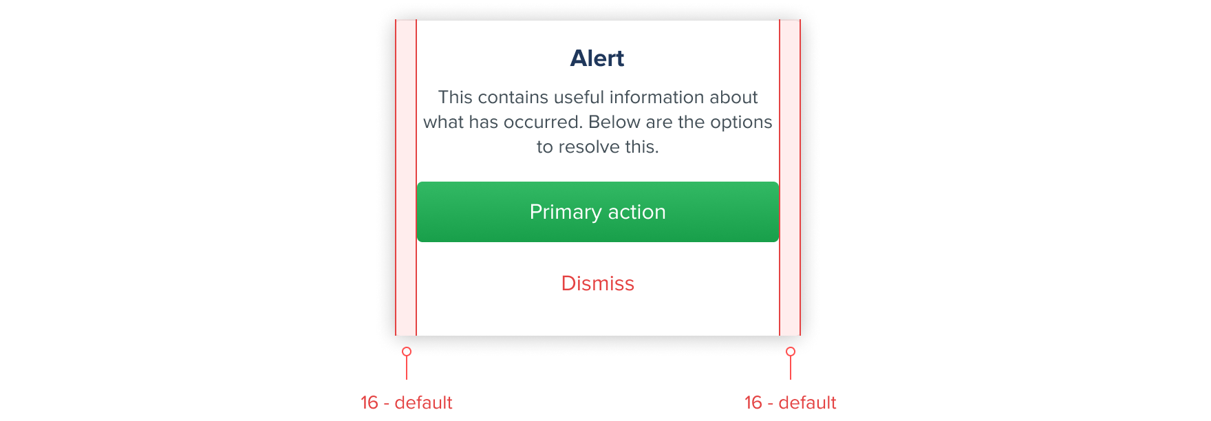
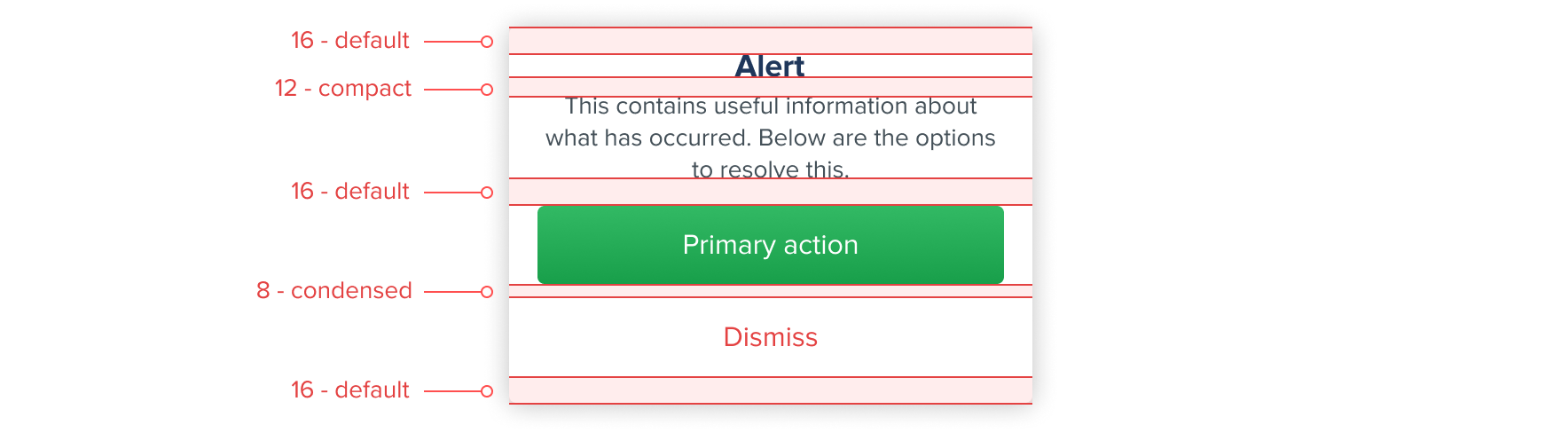
Alerts have a fixed width of 295px allowing it to be reused across multiple screen sizes and should always be centered within the screen. Buttons (actions) should always be stacked vertically with the priority order descending. Alerts can only be removed by interacting with one of the methods of resolution displayed.
Default
The default Alert comes with two actions, a Standard button, regular as the Primary action which can be styled appropriately to the use case and a Naked button, regular as the destructive (Dismiss) action which can also be styled appropriately to the use case.
Single action
A single action Alert can be used when there is only one method of resolution for the user. Our recommendation would be to use a Standard button, regular for this single action although other Button types can be used if appropriate for the use case.

Triple action
A triple action Alert can be used when there are multiple options of resolution for the user.