Cards
Cards are one of the most versatile components in our library. A humble information container in its most simplistic form but able to adapt in a modular fashion to cope with the most complicated of requirements.
Outlined below are the building blocks of our cards and some examples to help you get started.
Basic structure
All cards have a defined container and can be built upon with a few optional sections:
- Container
- Header
- Footer
Each section has its own variables and modular components but the only one required is the container itself as it houses everything card related.
Containers
Nice and simple, this offers the ability to contain all manner of content. By default all containers have a fill of white. When laying out multiple containers on a screen follow the spacing guideline recommendations.
Full-width cards
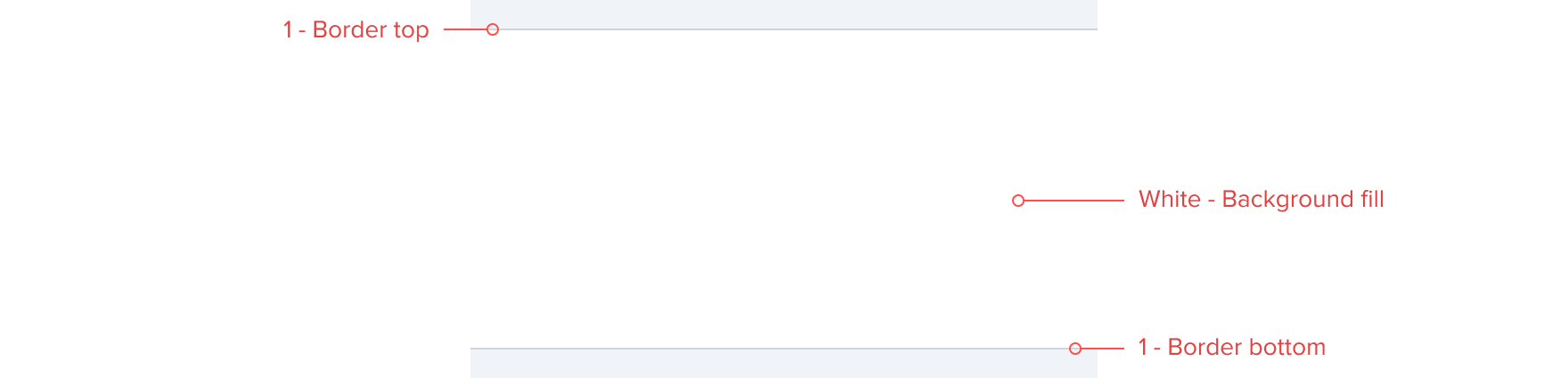
Full-width cards are our default containers on small screens. Full-width cards are perfect for containing large groups of content, for example a list of markets on Sportsbook. Full-width cards have a top and bottom border of 1 and have no outer spacing at either side ensuring the cards touch the edge of the screen.
Floating cards
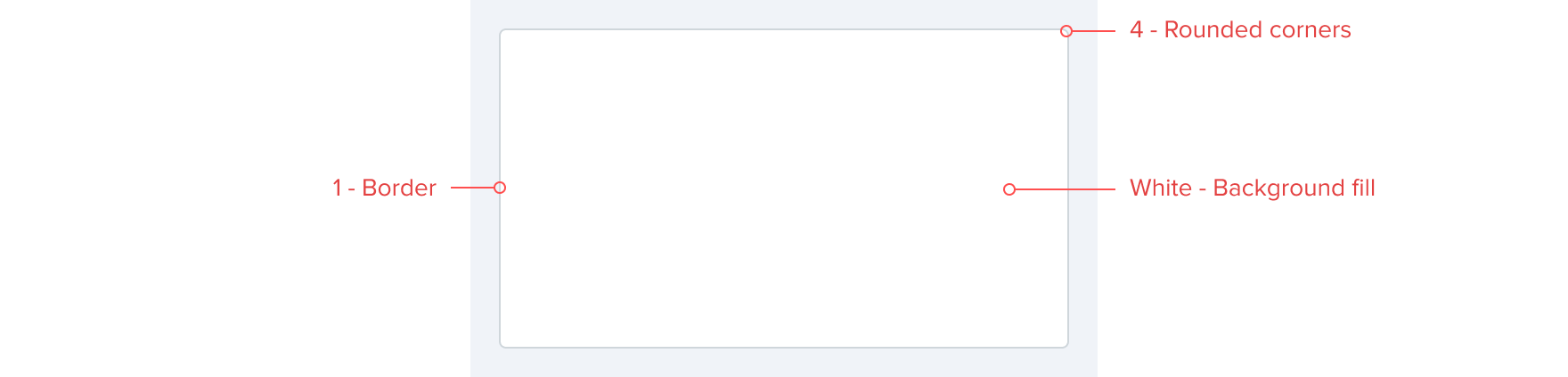
Floating cards should be used when full-width cards aren’t appropriate. Floating cards are great for containing small groups content on one screen, for example various contest groups within Discover on Fantasy. Floating cards have a internal border of 1 with rounded corners of 4. Floating cards are inset and do not touch the edge of the screen. We recommend a minimum spacing of 16 - default either side. For more information view our spacing guidelines.

Internal spacing
Internal spacing is crucial to ensuring that there is consistent and adequate spacing within each card. Internal spacing also ensures that content within different cards is vertically aligned creating a quickly scannable list. Our default recommendation is all containers have internal spacing of 16 - default ensuring correct alignment across different cards. For more information view our spacing guidelines.


Header
Card headers can be used to frame the section itself with a title. This is especially useful if there are going to be multiple cards on one page. The header should include a bottom border of 1 and we recommend heading text size of 16 - epsilon bold. Headers should also follow the spacing guidelines for consistency.
The optional card header should act as a baseline for product adaptation.


Footer
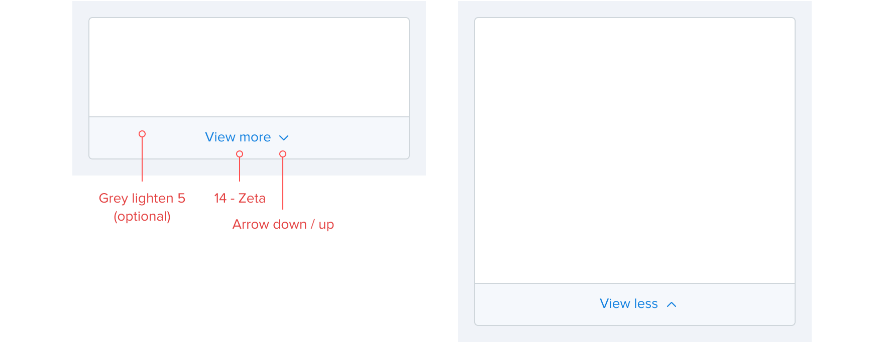
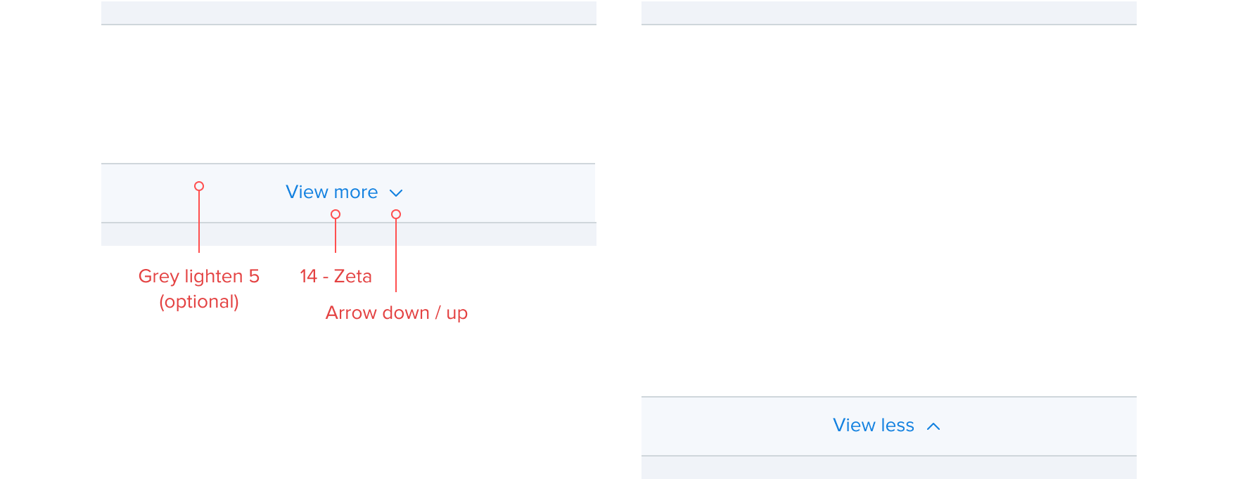
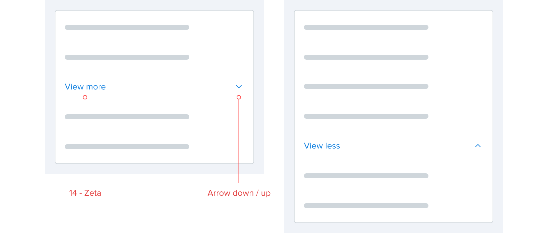
Card footers can contain links that allow the user to navigate and access additional information if and when required. The footer should include a top border of 1 with link text size of 14 - zeta. The footer can use an optional background highlight color and an arrow right to support the link.
The optional card footer should act as a baseline for product adaptation.


Expand
In certain situations it’s beneficial to artificially limit the vertical height of a card to ensure a page length that’s digestible. This is especially true on mobile devices where we may want to set a max height on certain cards. With this in mind the View more component can be attached to within or bottom of the card. When selected the card expands to its natural size with the View more text becoming View less and the arrow changing direction. When expanded, all content below the card is pushed down with the scroll position not altered allowing the user to scroll down to read the additional content. When collapsing, all content below is pushed up with the scroll position not altered allowing the user to scroll up to view the original content if necessary.
Bottom
Within
Balloons
Balloons are used to visually connect a card to another element. Balloons can feature an arrow on any side with a spacing of 8 - condensed between elements. The container has elevation-low applied with the arrow, 8 in height with a width of 16.


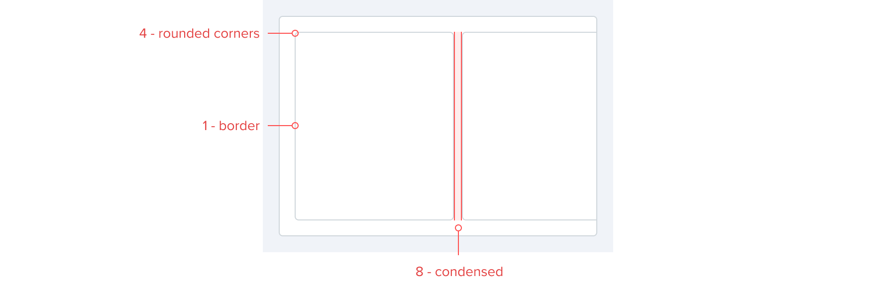
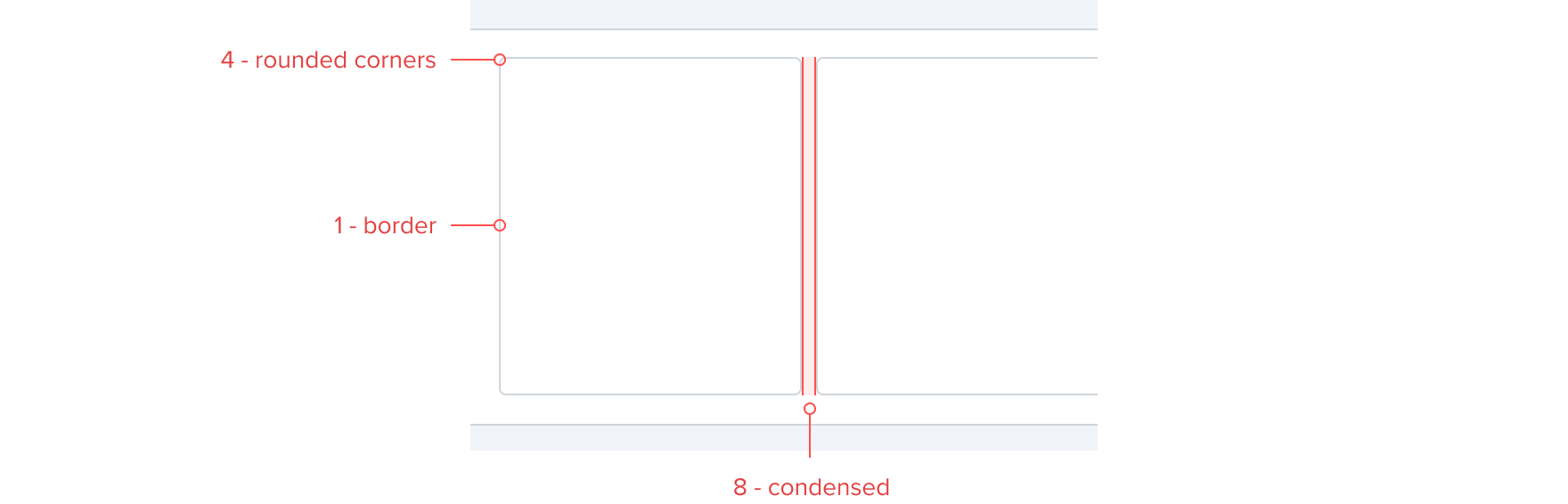
Cards within Cards
In certain situations placing cards within cards is beneficial for example a horizontal scrolling carousel. Internal cards inherit the floating card container style of a border of 1 with rounded corners of 4 and spacing in between of 8 - condensed. Internal cards are masked by the parent card container or the screen edge.