Text fields
Text fields are the primary method of text entry within forms. Users should be able to easily provide information and make adjustments based on any validation present in the form.
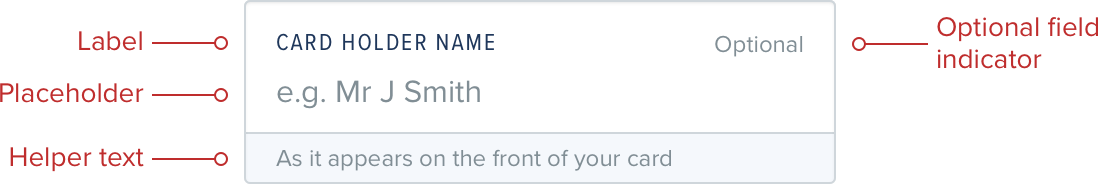
Labels
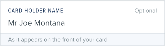
Labels give users a clear indication of the information required in the text field. Labels should not be used to provide examples or helper information.
Placeholders
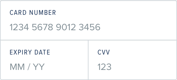
When writing placeholder text it’s important to not duplicate the label. Instead try to offer an example of what text a user would be expected to enter, with e.g. as the prefix to show that the text displayed is a placeholder and not a pre-populated value.
Do
Provide an example of the content

Don't
Duplicate the label text

Helper text
Helper text allows for some minor extra information to be attached to the field itself, for example giving guidance on password strength, or length requirements. If the helper text is more than a line or two then the text should be broken out of the field into its own paragraph above the field.
Do
Use helper text to provide additional guidance for users
States
Initial
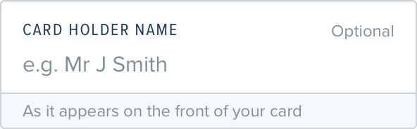
When a text field is displayed to a user that has no preset value, or validation the user should be given direction as to what needs to be entered through the use of a Label, and a Placeholder. Additional helper text can be used if additional direction is needed.
Focused
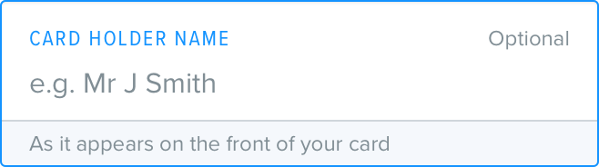
When a user has clicked/tapped in to a text field the bar/border and Label color is changed to fanduelBlueD1 and linkColor.
Populated
When a user has entered data and is no longer focused on the field or if a value is available for the field without data entry, for example loading a previously submitted form, the Placeholder is replaced with the Value.
Validation
When a form has been validated, either live as a user types or after submission to a system the text fields which have errors are displayed with bar/border and Label colors in red, with the error message is displayed beneath the inputted value.

Grouping
When creating a more complicated form, grouping can really help build a visual hierarchy on the page. It’s important to think logically about the groups themselves though.
For example you might group day, month and year in a date of birth form. You could also group first name and last name. You wouldn’t want to group all of these together though as it will start to become overwhelming.
Spacing
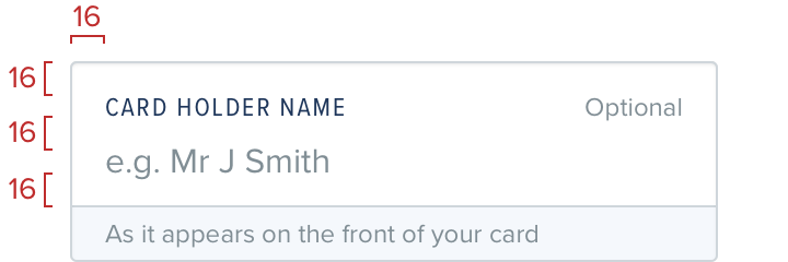
Text fields are spaced internally according to our standard guidelines, and ungrouped fields should be spaced with 16 - default between each field.