Notifications
Notifications are an important method of communicating with our users. We use notification to keep our users informed and provide appropriate feedback within our products. Notifications should never harm or devalue the user experience. Instead, they should contribute to an experience that helps users make better decisions or accomplish a goal.
Notification urgency
When considering which notification to use, we must first take into account what level of urgency we are trying to convey, from this we can then select the appropriate notification type and style.
| Urgency | Context | Example |
|---|---|---|
| High | Information of the highest importance, could be time sensitive, users are not impeded from using the product, but is not dismissible. | Schedule system downtime |
| Medium | Information of benefit or warning, users are not impeded from using the product, is dismissible. | Sporting event postponement |
| Low | User or system based feedback, users are not impeded from using the product, is dismissible and/or time based visibility. | Account settings updated |
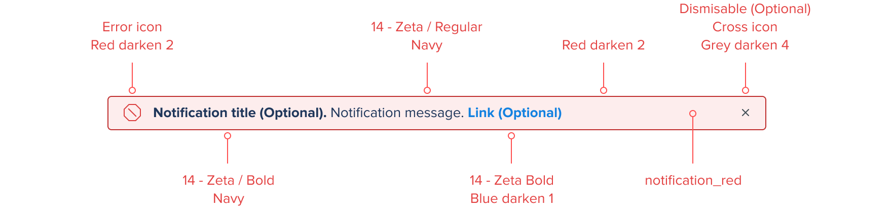
Notification types
We support a number of different notification types each having their own color reference and iconography.
| Type | Context | Color | Iconography |
|---|---|---|---|
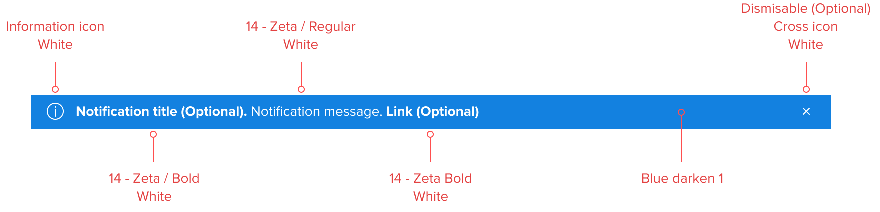
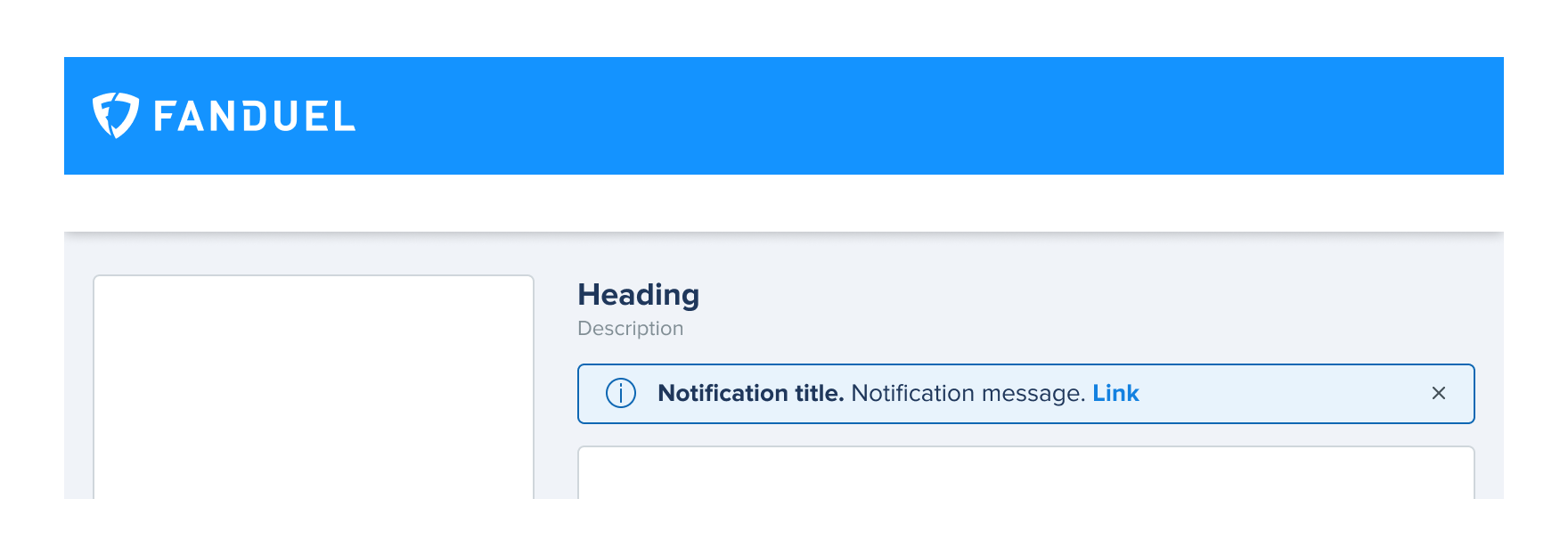
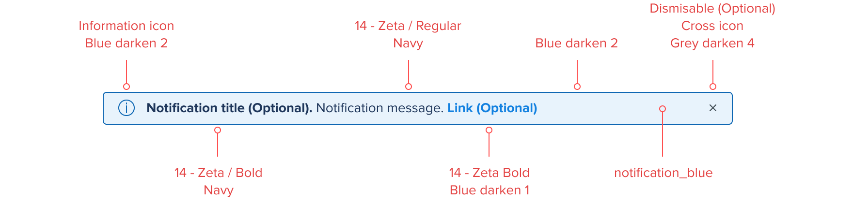
| Informational | Initiated by the application or system, independent of user action. Provides information to users that may not be tied to their current action or task. |  |
|
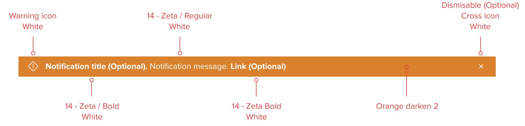
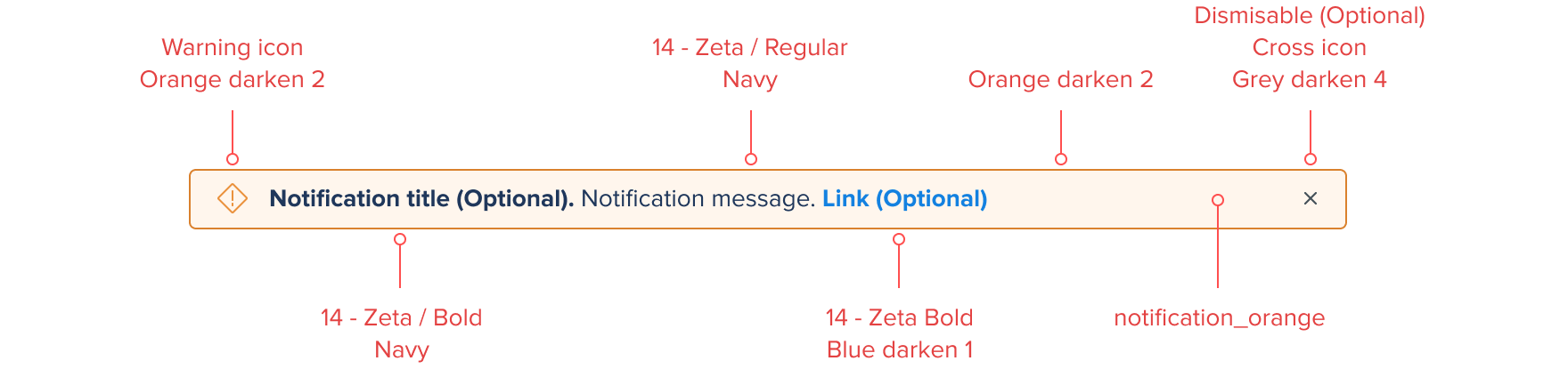
| Warning | Informs users of possible unexpected or undesirable results. |  |
|
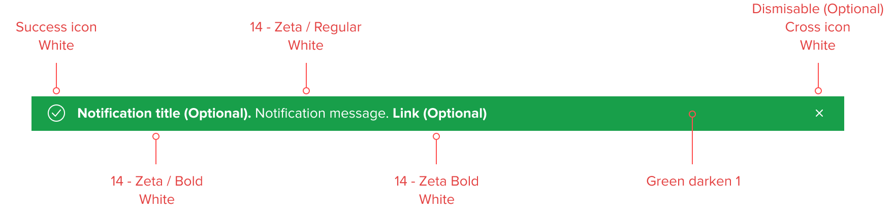
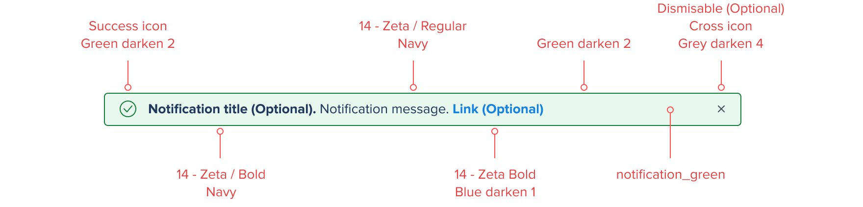
| Success | Task based notification. Users are given direct feedback on a user task. Confirms a task was completed as expected. |  |
|
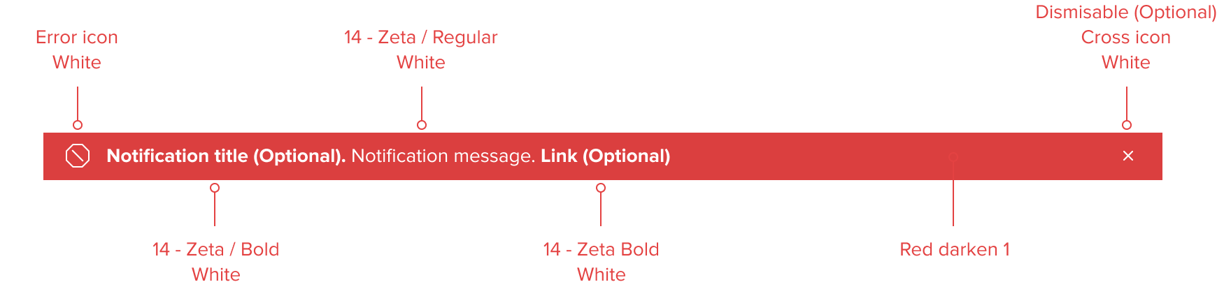
| Error | Task based notification. Users are given direct feedback based on a user or system task. Indicates a task was not completed as expected or critical failure. Users can be temporarily blocked until resolved. |  |
Notifications styles
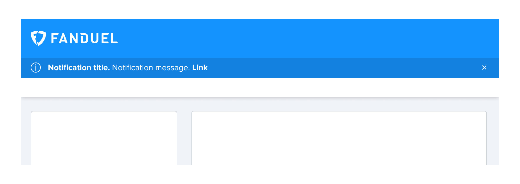
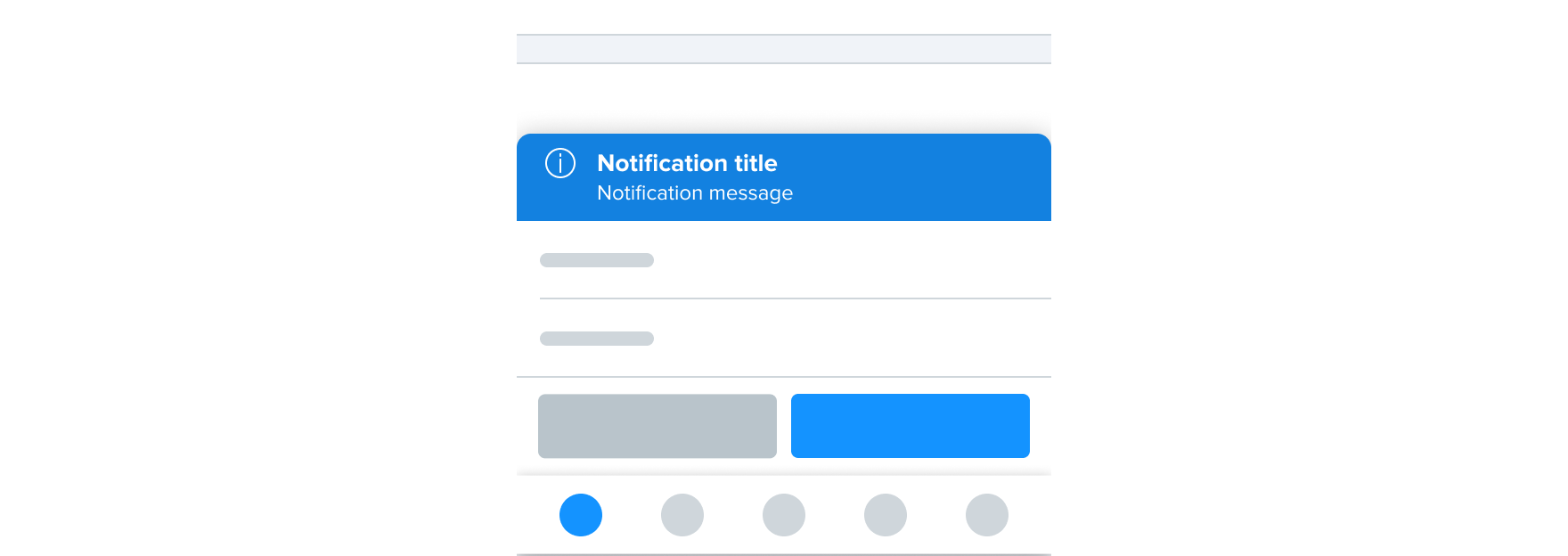
Fixed banner
Fixed banners should always appear below the application bar and are prevalent throughout the product. Fixed banners should adopt the Fixed layer elevation. Site wide announcements are an example of when to use a Fixed banner.
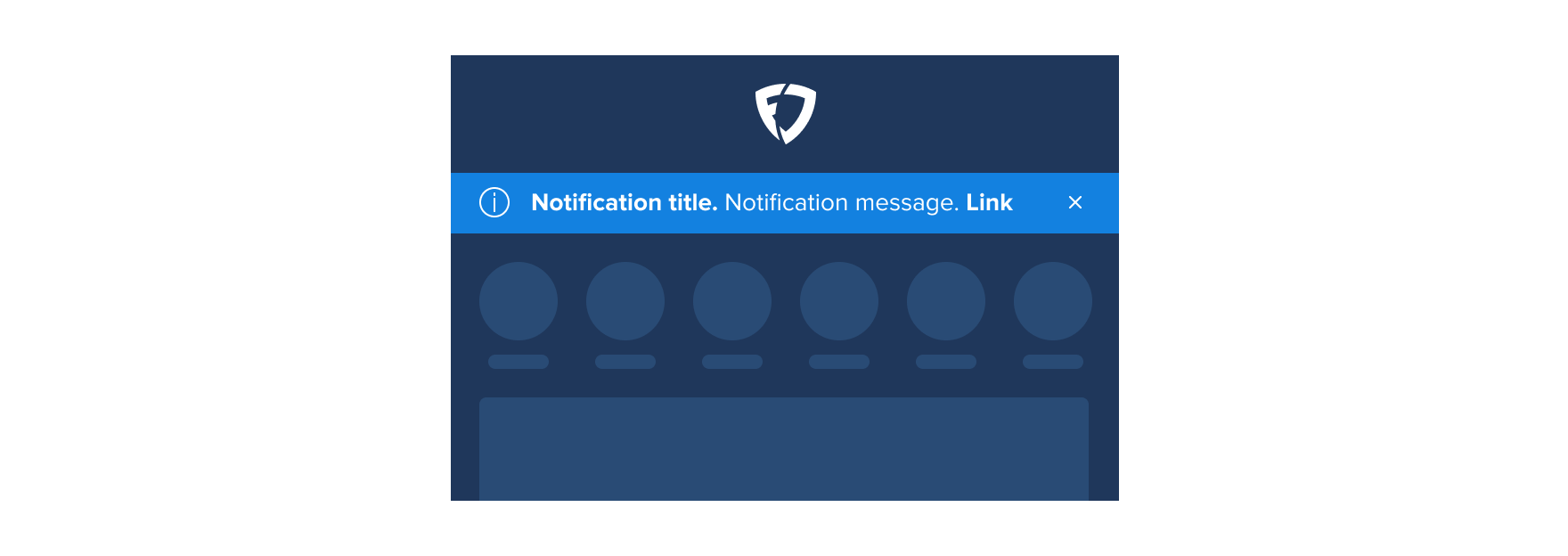
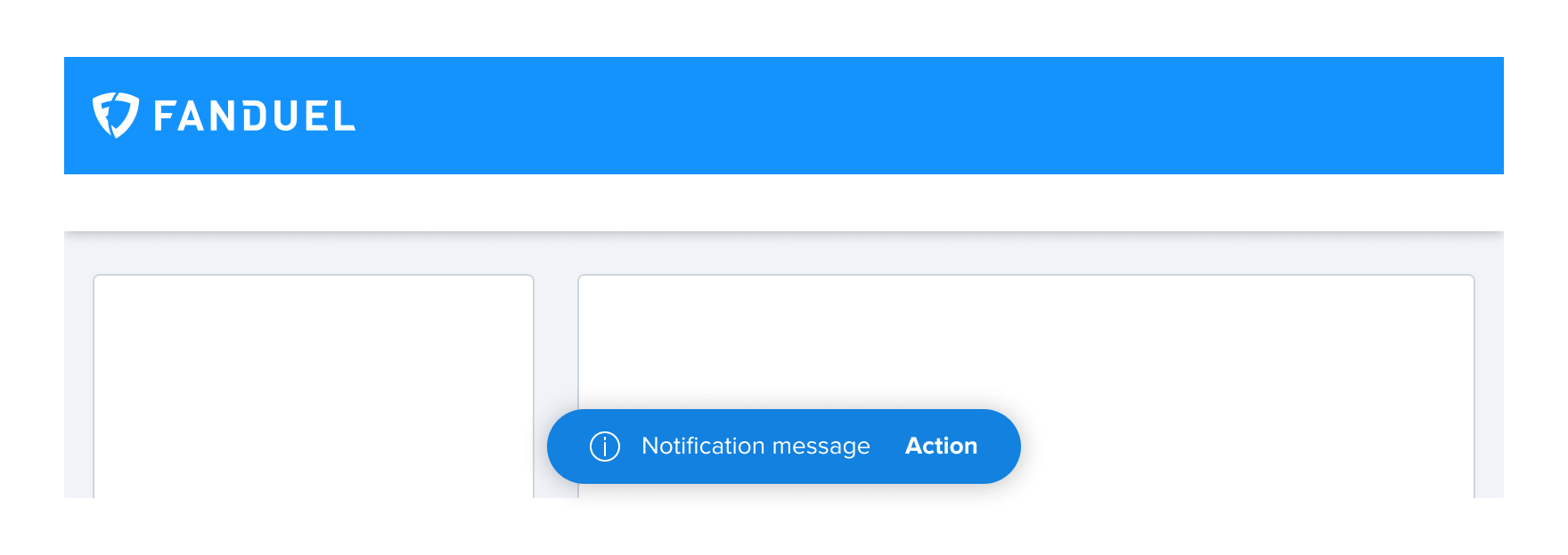
Floating banner
Floating banners should be placed on a particular area of the screen or above of a component/pattern they correspond to. Floating banners should scroll with the screen or component/pattern they correspond to. Slate or fixture alterations are an example of when to use a Floating banner.
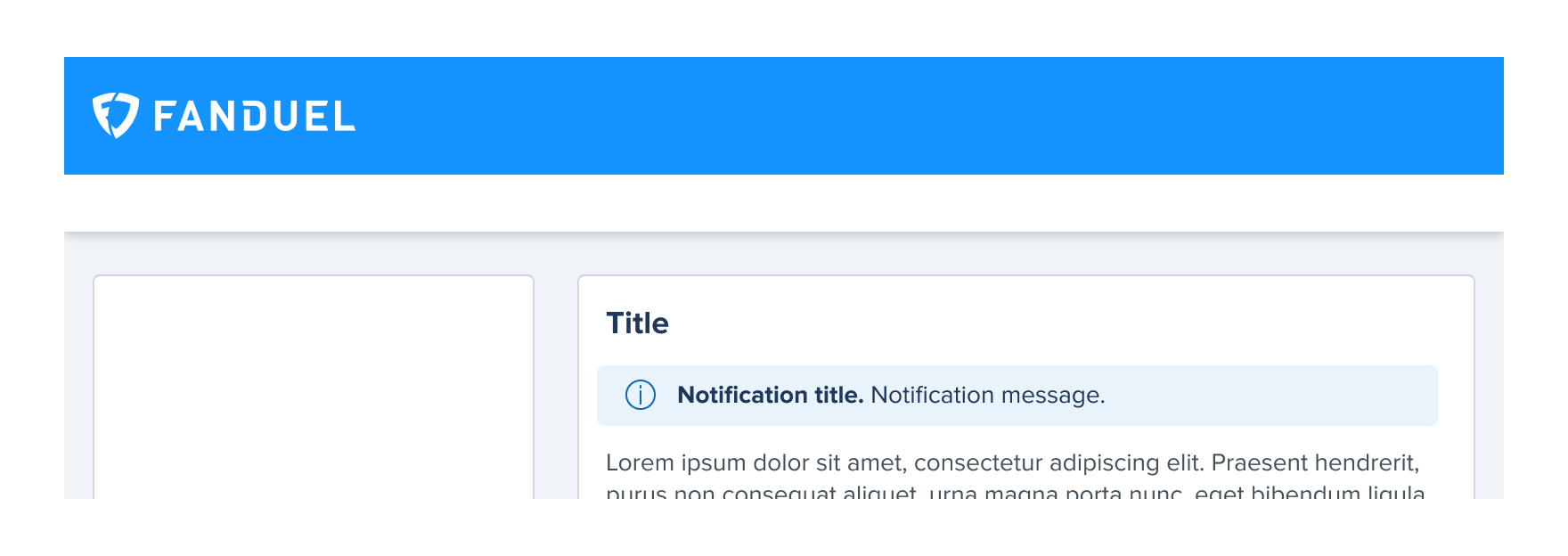
Inline message
Inline messages should be placed inside a component / pattern and address issues or feedback directly relating to the area. Promotional wager criteria is an example of when to use a Inline message.
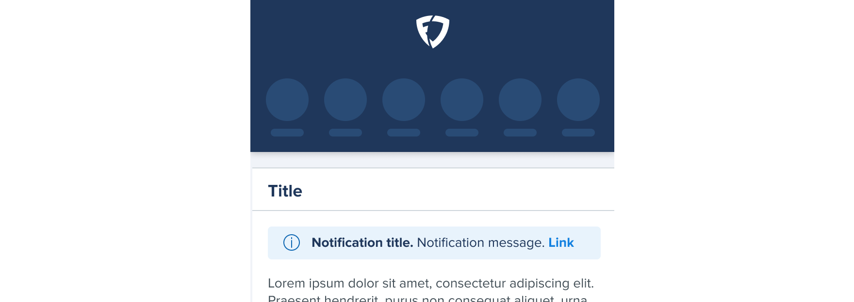


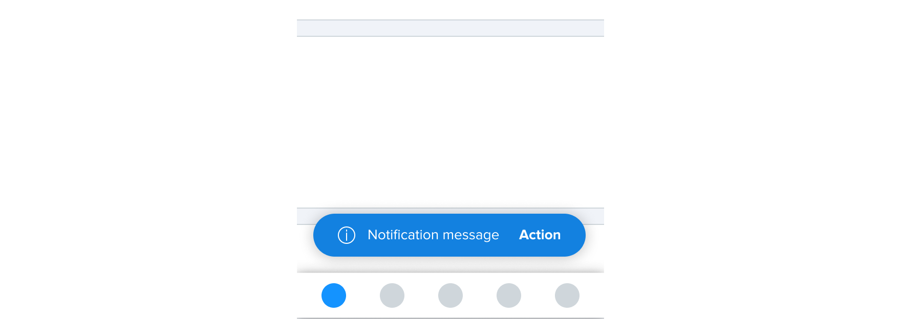
Fixed message
Fixed messages are pinned to a component or selected group of content within and address issues or feedback directly relating to the area. Successfully placed wager within quick bet is an example of when to use a Fixed message.
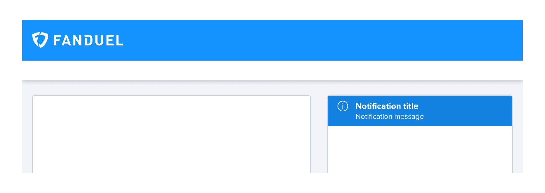


Toasts
Toasts are placed above all screen content and are visible by event based feedback. Toasts appear for a set time and disappear automatically. Successfully copied referral link is an example of when to use a Toast.


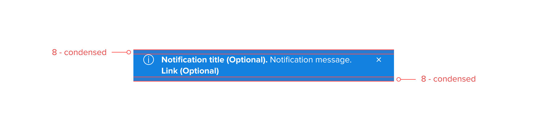
Spacing