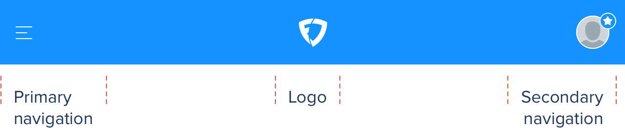
Application header
The application header appears at the top of all screens on Web platform and allows users to navigate to main areas of the website. It also provides easy access to the more general account and support related links.
Layout
The application header consists of 3 key sections:
- FanDuel Logo
- Primary navigation
- Secondary navigation
Small viewport sections:
Large viewport sections:

Spacing
The application header is 100% width of the viewport, 66px tall, and attached to the top of the viewport.

Components
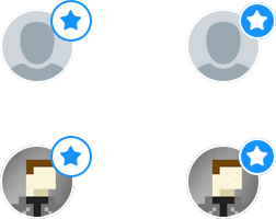
HEP
User avatars are shown if there is one available but if not a default user icon will be visible. If the user is considered a highly experienced player the relevant HEP icon will be shown in the top-right position of their avatar.
Breakpoints
By means of priority, 1 being the highest and 5 being the lowest, as the viewport increases we see elements come in as the space allows.
| Priority | Description |
|---|---|
| 1 | FanDuel Logo Shield |
| 1 | Hamburger & primary navigation |
| 1 | Account icon |
| 2 | Balance |
| 2 | Add Funds |
| 3 | RP (Responsible Play) |
| 3 | Help |
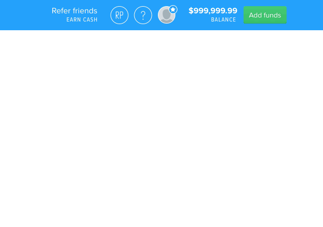
| 4 | Refer friends, Earn cash |
| 5 | FanDuel Logo full |
Breakpoint: 640px
Hamburger menu as primary navigation, FanDuel Shield centred and Account icon

Breakpoint: 760px
Shield logo is shown on left with primary navigation displayed in full. A condensed version of the secondary navigation appears on the right.

Breakpoint: 1024px
Refer friends and users account balance appears on the right within secondary navigation
Breakpoint: 1025px
FanDuel shield switches to full logo.

Navigation states
Primary navigation states
Small viewport contains a Responsible Play link in the active dropdown menu and flips the Hamburger menu to become an ‘X’ when active and then back again when innactive. Large viewport uses the tabs component: Tabs.
Small viewport:

Large viewport:

Secondary navigation states
Small viewport combines the Account and Help menu’s into one dropdown under the Account trigger. The Account/HEP icon flips to an ‘X’ when active and then back again when innactive.
Small viewport:

Large viewport:
Logged out
| Small viewport | Large viewport |
|---|---|
| Logo(full) | Logo(full) |
| Log in button | Responsible Play links to Responsible Play page |
| Join button | Help links to Support |
| Log in button | |
| Join button |
Small viewport:

Large viewport:
