Components
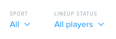
Filter
Last updated: September 2019
Used to change specific content in a view.
Component styling
The filter type label text at the top is Proxima Nova Condensed, 10 Grey Darken 2
The selection text is Proxima Nova regular, 14 link color with a link color down arrow to the right of the selection text

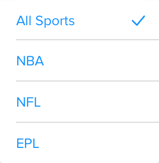
Dropdown styling
Each selection item is 40 tall with a 1 Grey Lighten 2 border
Selection text is Proxima Nova regular, 14link color with link color tick to the right of the selected item
Dropdown background should be white with card shadow properties
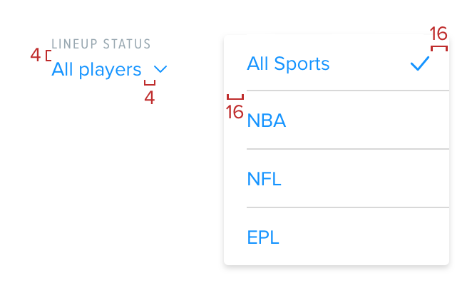
Spacing
The filter component has 4 between the label and text selection and 4 between the selection text and the dropdown arrow
The filter dropdown has 16 between the left edge and start of the border line as well as the tick and right edge
The filter component should have
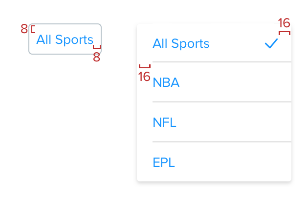
8 all around. The dropdown is the same spacing as Web.