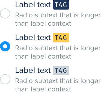
Tags
Tags bring attention to a specific piece of content within FanDuel products. They are designed to be used alongside other UI elements to aide a users understanding and can also help promote important content.
Tags are a useful component, however they should not be overused otherwise their significance can be diminished.
Color
Color use with tags is extremely important. To ensure text is legible we have set out colors that should be used for primary and secondary tags. If other color combinations are required, for example, partnership branding then these must be approved by a member of the product design team.
There are three approved color combinations; fanduelNavy which should be paired with onDarkTextColor text, fanduelYellow which should be paired with headlineTextColor text and fanduelGreyL2 background which should be paired with headlineTextColor text . The grey version can be used to explain items but without making them overly prominent.

Typography
The type size is set to 12 - eta and uses uppercase Proxima Nova Condensed with letter spacing of 1. Text color is dictated by the background color, use the above Color rules.
Spacing
Tags have a height of 16 - default with padding of 4 - micro. Tags should be 4 - micro away from their paired content to ensure they are related.

In the unlikely event that a tag combined with the paired content exceeds the available horizontal spacing, the tag should wrap onto the line below.

Two tags must never be paired with a single piece of content. They designed to be applied in a singular fashion to aid recognition for the user.
Do
Use single tags paired with content

Don't
Use multiple tags paired with content

Corners
The corner radius for tags across all platforms is 2.