Motion
Motion is an important aspect of our product that helps to create spatial awareness, bring focus and delight the user. Often overlooked, it is important that we consider motion when designing so that we can create the best possible experience for our users.
Spatial relationships
Motion can be used to create spatial relationships between views, components and elements as this can help contextualise the journey for the user and reduce the chance of change blindness.
Always consider what the relationship is between two the views: Is there a common element? Is the user progressing to the next step? Just be careful not to over use animation. We want to create clarity not confusion.
Do
Create clear, crafted spatial relationships

Don't
Use harsh or lazy transitions

Duration
Motion should not hinder the user experience so it’s important that the transitions and animations we design do not cause unnecessary waiting. A general rule is to keep animations below 500ms and above 200ms. When trying to get the timing right take in to consideration the distance the element is moving on screen. For example if it is a short distance then a value closer to 200ms would be more suitable.
Do
Keep animations and transitions snappy

Don't
Create unnecessary waiting

Bezier curves and easing
Bezier curves are how we represent our easing values. Easing helps our animations to be fluid and natural. This gives character and can contextualises information (for example, if a user does something wrong the component might shake).
We have 3 curves we use at FanDuel to keep our motion consistent across all applications. The animation below shows the curves applied to an object moving from left to right and back again. Each animation is exactly the same duration so you can see how each curve alters the motion of the object compared to no curve (linear).
Below are the individual curves in more detail.These are general guidelines to help you apply easing to your animation but are not hard rules so use your best judgement on what feels most natural.
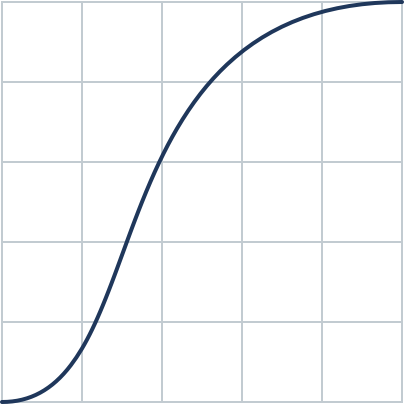
Standard (Ease In Out)

cubic-bezier(0.40,0.00,0.20,1.00)
This is a standard curve which starts and ends slow but picks up speed in the middle. To create a more natural movement we use an asymmetrical curve.
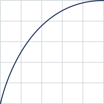
Deceleration (Ease Out)

cubic-bezier(0.00,0.00,0.20,1.00)
This curve will start fast and then slow down. This is best used for objects entering the screen.
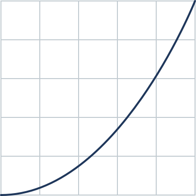
Acceleration (Ease In)

cubic-bezier(0.40,0.00,1.00,1.00)
This curve will start slow and then speed up. It is best used for objects leaving the screen.