Spacing
A clear information hierarchy is pivotal to the legibility of a page. With that in mind it’s incredibly important we have a robust and flexible spacing system that supports our components, patterns and layouts. These guidelines are here to help facilitate the spacing across our products without being too prescriptive. Every component, pattern and layout should reference this system and stay true to the spacing scale.
Spacing scale
| Value | Name | Example |
|---|---|---|
2 | nano | |
4 | micro | |
8 | condensed | |
12 | compact | |
16 | default | |
24 | comfortable | |
32 | spacious | |
40 | generous | |
48 | vast |
Spacing references
Small screen - Vertical spacing
Vertical spacing is crucial in ensuring that all content is aligned correctly. To ensure equal spacing and alignment we applied 16 default margins to the left and right screen edge with 8 condensed in-between cards.

Small screen - Horizontal spacing
Horizontal spacing between a components/modules is set at 16 default in order to ensure a clear visual separation between each.

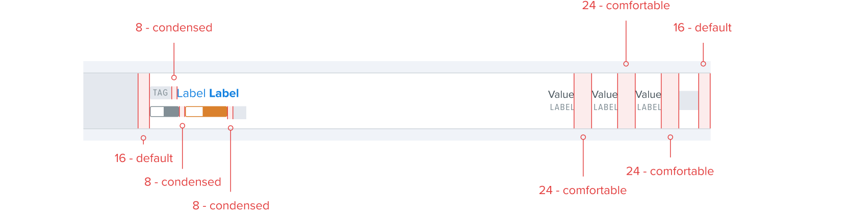
Small screen - Component spacing
In components the use-case, content and context are the biggest factors when applying appropriate spacing for clear information hierarchy and legibility. In general spacing values between 8 condensed to 16 default will provide the best visual balance.


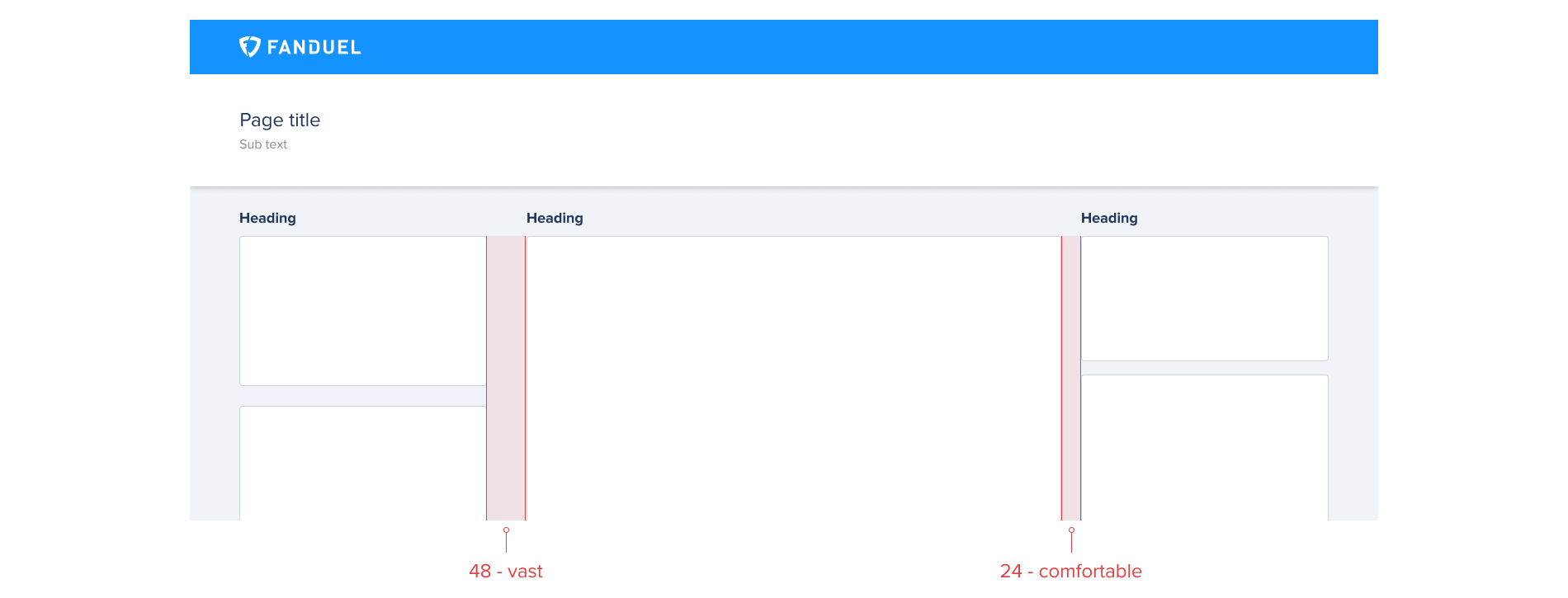
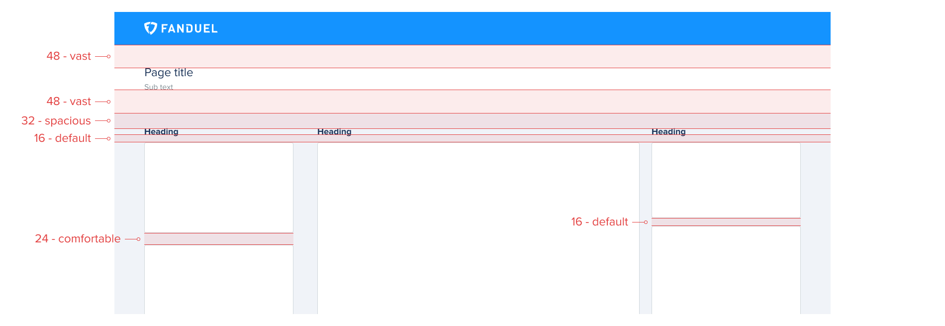
Large screen - Vertical spacing
Vertical spacing on larger screens is determined by the relationship of each individual component/module. Unrelated components/modules such as side navigation or promotional modules have 48 vast applied between them and any other content, creating a clear separation. Related content have 24 comfortable applied to create a clear connection whilst keeping a visual balance between.
Large screen - Horizontal spacing
Ensuring the correct horizontal spacing between a components/modules will help to visually connect/disconnect each. Unrelated components/modules have 24 comfortable horizontal spacing between them. Related content that is displayed across multiple components/modules has a vertical spacing of 16 default helping create a clear connection.
Large screen - Component spacing
The spacing inside of a component is dependant on the screen space taken up by each individual component. If that component is only taking up a quarter of the screen as it’s just a small part of the layout as a whole, then it makes sense to use spacing from the smaller end of the scale. Think less about the width of the screen itself and rather the width of the container that holds it. If that component is taking up 2/3 of the screen then it makes sense to apply larger spacing.

Type spacing
Due to limitation with our hand off tools, implementing the correct spacing values with the correct visual balance must come from a Design - Engineering conversation, do not rely on hand off tool to reference the correct spacing scale values needed during implementation.
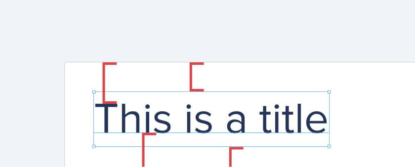
Add space from the top of text, not the top of its bounding box
The values in these guidelines refer to rendered spacing. In a text item, the top edge of the bounding box in Figma is always a few units above the top of the text (ascenders), because of leading/line-height/line spacing. Therefore, the spacing between the text box and anything above it will not be the same as the desired rendered spacing, which should be between the actual top of the text and the item above it.
Add space from the baseline of text, not the bottom of the text
When adding space between the bottom of text and an item below it, always space from the baseline of the text, not the very bottom (descenders). By doing this, the spacing will look visually correct regardless of whether the text has any descenders.